Version 2025-07 is the last API version to support React-based UI components. Later versions use web components, native UI elements with built-in accessibility, better performance, and consistent styling with Shopify's design system. Check out the upgrade guide to upgrade your extension.
Radio
The RadioButtonList component presents radio button options for single selection from a list of string values. Use it when merchants need to choose exactly one option from a defined set of choices.
The component ensures single-selection behavior with clear visual indication of the selected option and disabled states for unavailable choices, making it suitable for settings, preferences, and any scenario requiring exclusive choice from multiple options.
Anchor to Use casesUse cases
- Single selection: Create options where users must select exactly one choice from alternatives.
- Filtering controls: Implement filtering where users choose a single category or status.
- Payment options: Provide option selection for payment methods or shipping options.
- Preference selection: Enable preference selection for display modes or sort orders.
Anchor to PropertiesProperties
Configure the following properties on the RadioButtonList component.
- string[]string[]requiredrequired
An array of string values representing the radio button options available for selection.
- (item: string) => void(item: string) => voidrequiredrequired
A callback function executed when a radio list item is selected, receiving the selected item string as a parameter. You must update the
property in response to this callback to reflect the new selection.- booleanboolean
A boolean that determines whether the initially selected item renders at the top of the list, automatically scrolling to show the selected option.
- stringstring
The name of the currently selected item. You control the selection by setting this property and updating it when
fires.
Anchor to ExamplesExamples
Anchor to Select one option from a listSelect one option from a list
Enable single selection from multiple options using radio buttons. This example demonstrates a RadioButtonList that presents exclusive choices with clear visual indication of the selected option, ideal for settings, preferences, or any scenario requiring one choice from several options.Select one option from a list
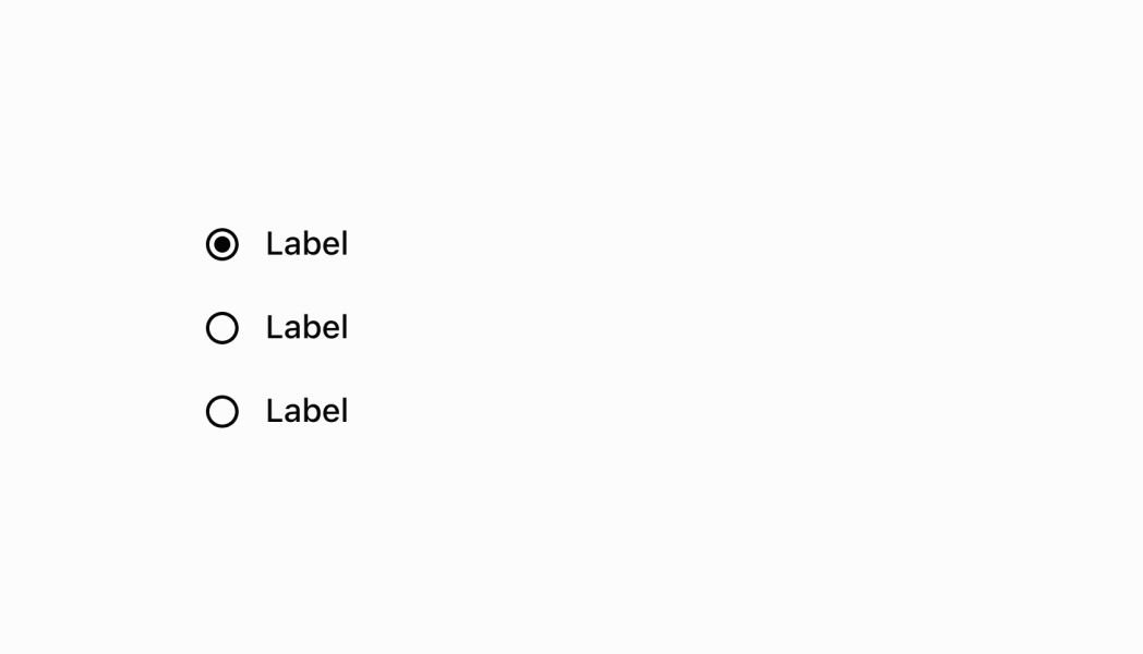
Select one option from a list
React
import React from 'react';
import {
  reactExtension,
  RadioButtonList,
  Screen,
  ScrollView,
  Text,
} from '@shopify/ui-extensions-react/point-of-sale';

const SmartGridModal = () => {
  const [selected, setSelected] =
    React.useState('');

  return (
    <Screen
      name="RadioButtonList"
      title="RadioButtonList"
    >
      <ScrollView>
        <RadioButtonList
          items={['1', '2', '3']}
          onItemSelected={setSelected}
          initialSelectedItem={selected}
        />
        <Text>{selected}</Text>
      </ScrollView>
    </Screen>
  );
};

export default reactExtension(
  'pos.home.modal.render',
  () => {
    return <SmartGridModal />;
  },
);
TS
import {
  extension,
  RadioButtonList,
  Screen,
  ScrollView,
  Text,
} from '@shopify/ui-extensions/point-of-sale';

export default extension(
  'pos.home.modal.render',
  (root) => {
    const mainScreen = root.createComponent(
      Screen,
      {
        name: 'RadioButtonList',
        title: 'RadioButtonList',
      },
    );
    const scrollView =
      root.createComponent(ScrollView);

    const text = root.createComponent(Text);

    const radioButtonList = root.createComponent(
      RadioButtonList,
      {
        items: ['1', '2', '3'],
        onItemSelected: (selected) => {
          text.replaceChildren(selected);
          radioButtonList.updateProps({
            initialSelectedItem: selected,
          });
        },
      },
    );

    scrollView.append(radioButtonList);
    scrollView.append(text);

    mainScreen.append(scrollView);
    root.append(mainScreen);
  },
);
Anchor to Best practicesBest practices
- Manage selection state in your app: Use
initialSelectedItemandonItemSelectedtogether to manage selection state. When a user selects an item,onItemSelectedfires with the selected value—you must then updateinitialSelectedItemwith this new value to reflect the selection in the UI. - Enable auto-scrolling for better UX: Set
initialOffsetToShowSelectedItemto true when you have long lists and want. This improves usability by eliminating the need for users to scroll to find their current selection. - Track selections in your app code: Maintain the selected item value in your app state (for example, using React
useState). WhenonItemSelectedfires, update your state with the new selection, which will then update theinitialSelectedItemproperty to reflect the change. - Consider list length and scrolling: For long option lists, use the
initialOffsetToShowSelectedItemproperty to improve initial display. Design your interface to handle scrollable lists gracefully, especially on smaller POS device screens.
Anchor to LimitationsLimitations
- RadioButtonList accepts only string arrays for options—complex option objects with additional metadata or custom rendering require alternative components or additional state management.
- The component is designed for single selection only—multiple selection scenarios require alternative approaches or custom implementation.
- RadioButtonList requires you to manage the selected value in your app must update
initialSelectedItemin response toonItemSelectedevents to reflect the new selection in the UI.