Text area
The text area component captures multi-line text input. Use it to collect descriptions, notes, comments, or other extended text content.
The component supports configurable height, character limits, and validation. For single-line text input, use text field.
Anchor to Use casesUse cases
- Descriptions: Collect product descriptions or notes in inventory management workflows.
- Customer notes: Capture comments, special instructions, or notes in order processing.
- Feedback: Enable feedback collection or issue reporting with detailed explanations.
- Multi-line entry: Support multi-line text for addresses, delivery instructions, or requirements.
Anchor to PropertiesProperties
Configure the following properties on the TextArea component.
- Anchor to detailsdetailsdetailsstringstring
The additional text to provide context or guidance for the field. This text is displayed along with the field and its label to offer more information or instructions to the user. This will also be exposed to screen reader users.
- Anchor to disableddisableddisabledbooleanbooleanDefault: falseDefault: false
Whether the field is disabled, preventing user interaction. Use when the field is temporarily unavailable due to application state, permissions, or dependencies.
- Anchor to errorerrorerrorstringstring
An error message to indicate a problem to the user. The field will be given specific stylistic treatment to communicate issues that must be resolved immediately.
- Anchor to idididstringstring
A unique identifier for the element used for targeting with CSS, JavaScript, or accessibility features.
- Anchor to labellabellabelstringstring
The content to use as the field label that describes the text information being requested.
- Anchor to maxLengthmax
Lengthmax Length numbernumberDefault: InfinityDefault: Infinity The maximum number of characters allowed in the text field.
- Anchor to placeholderplaceholderplaceholderstringstring
A short hint that provides guidance about the expected value of the field.
- Anchor to requiredrequiredrequiredbooleanbooleanDefault: falseDefault: false
Whether the field needs a value. This requirement adds semantic value to the field but doesn't cause an error to appear automatically. Use the
errorproperty to present validation errors.- Anchor to rowsrowsrowsnumbernumberDefault: 2Default: 2
The number of visible text lines that determines the initial height of the text area.
- Anchor to valuevaluevaluestringstring
The current text content entered in the field. An empty string means no text is entered.
Anchor to SlotsSlots
The text area component supports slots for additional content placement within the field. Learn more about using slots.
- Anchor to accessoryaccessoryaccessoryHTMLElementHTMLElement
The additional content to be displayed in the field. Commonly used to display clickable text or action elements. Only button and clickable components with text content only are supported in this slot. Use the
slot="accessory"attribute to place elements in this area.
Anchor to EventsEvents
The text area component provides event callbacks for handling user interactions. Learn more about handling events.
- Anchor to blurblurblur(event: CallbackEvent<"s-text-area">) => void(event: CallbackEvent<"s-text-area">) => void
Called when the element loses focus.
- Anchor to changechangechange(event: CallbackEvent<"s-text-area">) => void(event: CallbackEvent<"s-text-area">) => void
Called after editing completes, typically on blur.
- Anchor to focusfocusfocus(event: CallbackEvent<"s-text-area">) => void(event: CallbackEvent<"s-text-area">) => void
Called when the element receives focus.
- Anchor to inputinputinput(event: CallbackEvent<"s-text-area">) => void(event: CallbackEvent<"s-text-area">) => void
Called when the user makes any changes in the field.
CallbackEvent
Represents the event object passed to callback functions when interactive events occur. Contains metadata about the event, including the target element, event phase, and propagation behavior.
- bubbles
Whether the event bubbles up through the DOM tree.
boolean - cancelable
Whether the event can be canceled.
boolean - composed
Whether the event will trigger listeners outside of a shadow root.
boolean - currentTarget
The element that the event listener is attached to.
HTMLElementTagNameMap[T] - detail
Additional data associated with the event.
any - eventPhase
The current phase of the event flow.
number - target
The element that triggered the event.
HTMLElementTagNameMap[T] | null
Anchor to ExamplesExamples
Anchor to Capture multi-line text with a text areaCapture multi-line text with a text area
Capture multi-line text input using a text area component. This example shows a basic text area with a label for extended content.Capture multi-line text with a text area
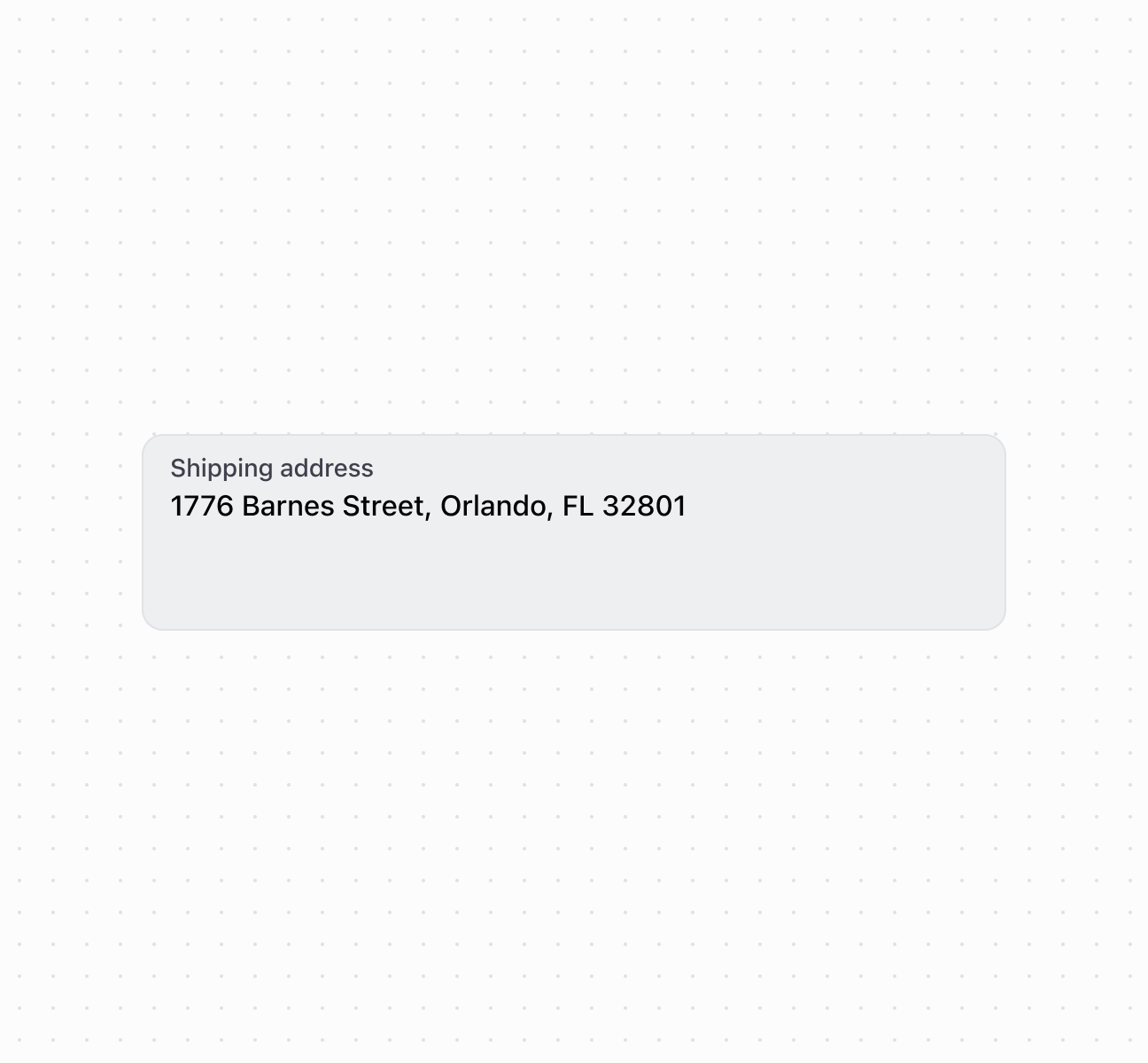
Capture multi-line text with a text area
Add action buttons to the text area using the accessory slot for quick actions like clearing text or formatting content. This example shows how to use s-button and s-clickable components in the accessory slot, providing inline functionality within the multi-line input context.
Add accessory buttons
Anchor to Configure rows and character limitsConfigure rows and character limits
Configure the number of visible rows and character limits to control text area size and input length. This example shows how to use the rows property to set initial height and maxlength to limit content, ensuring appropriate sizing for different types of text input.Configure rows and character limits
Anchor to Handle text input eventsHandle text input events
Subscribe to text area events to respond when merchants enter or modify text. This example demonstrates handling onChange, onInput, onFocus, and onBlur events for autosave functionality, character counting, or real-time validation of longer text content.Handle text input events
Anchor to Best practicesBest practices
- Set appropriate row count: Use 2-3
rowsfor brief notes, 4-6 for descriptions, and more for extensive content. - Show character limit feedback: When approaching
maxLength, display remaining characters in thedetailstext. - Write descriptive labels: Use specific labels like "Product Description" or "Special Instructions" rather than generic terms.
Anchor to LimitationsLimitations
The accessory slot supports only button and clickable components. Other component types can't be used for field accessories.