Consent checkbox
sms_marketing capability of the Customer Privacy capability group to work.The consent checkbox component collects buyer approval for a given policy. Use consent checkbox to gather opt-in consent for marketing, terms, or privacy policies.
Consent checkboxes support a policy attribute that connects to Shopify's consent framework. For standard multi-purpose checkboxes, use checkbox instead.
Only the sms-marketing policy is supported. Other consent policy types aren't available through this component.
Supported targets
- purchase.
checkout. actions. render-before - purchase.
checkout. block. render - purchase.
checkout. cart-line-item. render-after - purchase.
checkout. cart-line-list. render-after - purchase.
checkout. contact. render-after - purchase.
checkout. delivery-address. render-after - purchase.
checkout. delivery-address. render-before - purchase.
checkout. footer. render-after - purchase.
checkout. header. render-after - purchase.
checkout. payment-method-list. render-after - purchase.
checkout. payment-method-list. render-before - purchase.
checkout. pickup-location-list. render-after - purchase.
checkout. pickup-location-list. render-before - purchase.
checkout. pickup-location-option-item. render-after - purchase.
checkout. pickup-point-list. render-after - purchase.
checkout. pickup-point-list. render-before - purchase.
checkout. reductions. render-after - purchase.
checkout. reductions. render-before - purchase.
checkout. shipping-option-item. details. render - purchase.
checkout. shipping-option-item. render-after - purchase.
checkout. shipping-option-list. render-after - purchase.
checkout. shipping-option-list. render-before - purchase.
thank-you. announcement. render - purchase.
thank-you. block. render - purchase.
thank-you. cart-line-item. render-after - purchase.
thank-you. cart-line-list. render-after - purchase.
thank-you. customer-information. render-after - purchase.
thank-you. footer. render-after - purchase.
thank-you. header. render-after
Anchor to PropertiesProperties
Configure the following properties on the consent checkbox component.
- Anchor to accessibilityLabelaccessibility
Labelaccessibility Label stringstring A label used for users using assistive technologies like screen readers. When set, any children or
labelsupplied will not be announced. This can also be used to display a control without a visual label, while still providing context to users using screen readers.- Anchor to checkedcheckedcheckedbooleanbooleanDefault: falseDefault: false
Whether the control is currently checked.
- Anchor to commandcommandcommand'--auto' | '--show' | '--hide' | '--toggle''--auto' | '--show' | '--hide' | '--toggle'Default: '--auto'Default: '--auto'
Sets the action the
target should take when this component is activated. Available options:'--auto': Performs the default action appropriate for the target component.'--show': Displays the target component if it's currently hidden.'--hide': Conceals the target component from view.'--toggle': Alternates the target component between visible and hidden states.'--copy': Copies the target clipboard item.
The supported actions vary by target component type. Learn more about the
commandattribute.- Anchor to commandForcommand
Forcommand For stringstring The ID of the component to control when this component is activated. Pair with the
commandproperty to specify what action to perform on the target component. Learn more about theattribute.When both
andhrefare set,takes precedence. The command runs and the link doesn't navigate.- Anchor to defaultCheckeddefault
Checkeddefault Checked booleanbooleanDefault: falseDefault: false Whether the control is checked by default.
- Anchor to disableddisableddisabledbooleanbooleanDefault: falseDefault: false
Whether the control is disabled, preventing any user interaction.
- Anchor to errorerrorerrorstringstring
An error message displayed below the field to indicate validation problems. When set, the field is styled with error indicators and the message is announced to screen readers.
- Anchor to idididstringstring
A unique identifier for the element. Use this to reference the element in JavaScript, link labels to form controls, or target specific elements for styling or scripting.
- Anchor to labellabellabelstringstring
The text displayed as the control label, which identifies the purpose of the control to users. This label is associated with the control for accessibility.
- Anchor to namenamenamestringstring
The name attribute for the control, used to identify its value when the form is submitted. Must be unique within the nearest containing form.
- Anchor to policypolicypolicy'sms-marketing''sms-marketing'
The policy for which buyer consent is being collected. Used by the consent checkbox and consent phone field components to identify the type of marketing permission requested.
sms-marketing: Represents the policy for SMS marketing consent.
- Anchor to valuevaluevaluestringstring
The value used in form data when the control is checked.
Anchor to EventsEvents
The consent checkbox component provides event callbacks for handling user interactions. Learn more about handling events.
- Anchor to changechangechangeCallbackEventListener<typeof tagName>CallbackEventListener<typeof tagName>
A callback fired when the consent checkbox value changes.
Learn more about the change event.
CallbackEventListener
A typed event listener for custom element events. The listener receives a `CallbackEvent` with the correct `currentTarget` type for the associated custom element tag.
(EventListener & {
    (event: CallbackEvent<TTagName, Event> & TData): void;
}) | null
CallbackEvent
An event type that narrows the `currentTarget` to the specific HTML element associated with the custom element tag. This provides type-safe event handling in callback listeners.
TEvent & {
    currentTarget: HTMLElementTagNameMap[TTagName];
}
Anchor to ExamplesExamples
Anchor to Collect SMS marketing consentCollect SMS marketing consent
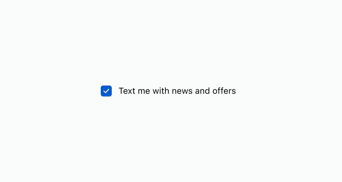
Show a pre-checked consent checkbox tied to a marketing policy. This example uses an s-consent-checkbox with defaultChecked and policy set to sms-marketing.Collect SMS marketing consent
html
Anchor to Display an unchecked consent promptDisplay an unchecked consent prompt
Prompt the buyer to actively opt in by leaving the checkbox unchecked. This example presents an s-consent-checkbox without defaultChecked, requiring the buyer to check it manually.html
Anchor to Best practicesBest practices
- Write transparent labels: Clearly describe what the buyer is agreeing to receive, including the type and frequency of messages.
- Use supported policies: For SMS marketing, set
policytosms-marketingso Shopify records consent on the customer. You can query the consent state with the GraphQL Admin API (SMS marketing consent). - Respect opt-in preferences: Use
defaultCheckedwhen opt-out is the norm. Leave it unchecked when explicit opt-in is required by regulation.