Checkbox
The checkbox component provides a clear way for users to make selections, such as agreeing to terms, enabling settings, or choosing multiple items from a list. Use checkbox to create binary on/off controls or multi-select interfaces where users can select any combination of options.
Checkboxes support labels and error states. For settings that take effect immediately, use switch instead.
Supported targets
- customer-account.
footer. render-after - customer-account.
order-index. announcement. render - customer-account.
order-index. block. render - customer-account.
order-status. announcement. render - customer-account.
order-status. block. render - customer-account.
order-status. cart-line-item. render-after - customer-account.
order-status. cart-line-list. render-after - customer-account.
order-status. customer-information. render-after - customer-account.
order-status. fulfillment-details. render-after - customer-account.
order-status. payment-details. render-after - customer-account.
order-status. return-details. render-after - customer-account.
order-status. unfulfilled-items. render-after - customer-account.
order. action. menu-item. render - customer-account.
order. action. render - customer-account.
order. page. render - customer-account.
page. render - customer-account.
profile. addresses. render-after - customer-account.
profile. announcement. render - customer-account.
profile. block. render - customer-account.
profile. company-details. render-after - customer-account.
profile. company-location-addresses. render-after - customer-account.
profile. company-location-payment. render-after - customer-account.
profile. company-location-staff. render-after - customer-account.
profile. payment. render-after
Supported targets
- customer-account.
footer. render-after - customer-account.
order-index. announcement. render - customer-account.
order-index. block. render - customer-account.
order-status. announcement. render - customer-account.
order-status. block. render - customer-account.
order-status. cart-line-item. render-after - customer-account.
order-status. cart-line-list. render-after - customer-account.
order-status. customer-information. render-after - customer-account.
order-status. fulfillment-details. render-after - customer-account.
order-status. payment-details. render-after - customer-account.
order-status. return-details. render-after - customer-account.
order-status. unfulfilled-items. render-after - customer-account.
order. action. menu-item. render - customer-account.
order. action. render - customer-account.
order. page. render - customer-account.
page. render - customer-account.
profile. addresses. render-after - customer-account.
profile. announcement. render - customer-account.
profile. block. render - customer-account.
profile. company-details. render-after - customer-account.
profile. company-location-addresses. render-after - customer-account.
profile. company-location-payment. render-after - customer-account.
profile. company-location-staff. render-after - customer-account.
profile. payment. render-after
Anchor to Use casesUse cases
- Marketing opt-in: Let customers subscribe to email or SMS marketing with a pre-checked or unchecked default.
- Terms acceptance: Require agreement to terms of service or privacy policies before submission.
- Add-on selection: Allow customers to select optional extras like gift wrapping or extended warranties.
Anchor to PropertiesProperties
Configure the following properties on the checkbox component.
- Anchor to accessibilityLabelaccessibility
Labelaccessibility Label stringstring A label used for users using assistive technologies like screen readers. When set, any children or
labelsupplied will not be announced. This can also be used to display a control without a visual label, while still providing context to users using screen readers.- Anchor to checkedcheckedcheckedbooleanbooleanDefault: falseDefault: false
Whether the control is currently checked.
- Anchor to commandcommandcommand'--auto' | '--show' | '--hide' | '--toggle''--auto' | '--show' | '--hide' | '--toggle'Default: '--auto'Default: '--auto'
Sets the action the
target should take when this component is activated. Available options:'--auto': Performs the default action appropriate for the target component.'--show': Displays the target component if it's currently hidden.'--hide': Conceals the target component from view.'--toggle': Alternates the target component between visible and hidden states.'--copy': Copies the target clipboard item.
The supported actions vary by target component type. Learn more about the
commandattribute.- Anchor to commandForcommand
Forcommand For stringstring The ID of the component to control when this component is activated. Pair with the
commandproperty to specify what action to perform on the target component. Learn more about theattribute.When both
andhrefare set,takes precedence. The command runs and the link doesn't navigate.- Anchor to defaultCheckeddefault
Checkeddefault Checked booleanbooleanDefault: falseDefault: false Whether the control is checked by default.
- Anchor to disableddisableddisabledbooleanbooleanDefault: falseDefault: false
Whether the control is disabled, preventing any user interaction.
- Anchor to errorerrorerrorstringstring
An error message displayed below the field to indicate validation problems. When set, the field is styled with error indicators and the message is announced to screen readers.
- Anchor to idididstringstring
A unique identifier for the element. Use this to reference the element in JavaScript, link labels to form controls, or target specific elements for styling or scripting.
- Anchor to labellabellabelstringstring
The visual content to use as the control label. Use a string to provide a simple text label displayed to the user.
If a
labelslot is also provided, the slot content takes precedence. Learn more about slots.- Anchor to namenamenamestringstring
The name attribute for the control, used to identify its value when the form is submitted. Must be unique within the nearest containing form.
- Anchor to requiredrequiredrequiredbooleanbooleanDefault: falseDefault: false
Whether the field needs a value. This requirement adds semantic value to the field, but it will not cause an error to appear automatically. If you want to present an error when this field is empty, you can do so with the
errorproperty.Adds semantic meaning for accessibility. Doesn't trigger automatic validation or display an error. Implement validation logic yourself and use the
errorprop to show results.- Anchor to valuevaluevaluestringstring
The value used in form data when the control is checked.
Anchor to EventsEvents
The checkbox component provides event callbacks for handling user interactions. Learn more about handling events.
- Anchor to changechangechangeCallbackEventListener<typeof tagName>CallbackEventListener<typeof tagName>
A callback fired when the checkbox value changes.
Learn more about the change event.
CallbackEventListener
A typed event listener for custom element events. The listener receives a `CallbackEvent` with the correct `currentTarget` type for the associated custom element tag.
(EventListener & {
      (event: CallbackEvent<TTagName, TEvent>): void;
    }) | null
CallbackEvent
An event type that narrows the `currentTarget` to the specific HTML element associated with the custom element tag. This provides type-safe event handling in callback listeners.
TEvent & {
  currentTarget: HTMLElementTagNameMap[TTagName];
}
Anchor to ExamplesExamples
Anchor to Opt in to email marketingOpt in to email marketing
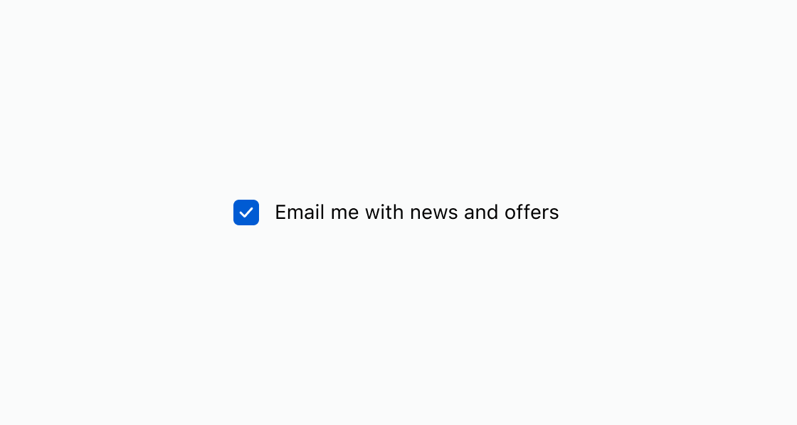
Pre-fill a marketing opt-in checkbox with a checked default state. This example shows a checkbox with checked and a descriptive label.Opt in to email marketing
html
Anchor to Require agreement before continuingRequire agreement before continuing
Enforce agreement to terms of service before continuing. This example uses a checkbox with required and an error message when the customer hasn't accepted.html
Disable a checkbox when the corresponding option isn't currently available. This example displays a checkbox with the
disabled attribute for a newsletter subscription.html
Anchor to Best practicesBest practices
- Write descriptive labels: Use clear, specific text that explains what the customer is agreeing to or selecting.
- Pre-check thoughtfully: Only use
checkedfor options that benefit the customer. Don't pre-check options that add cost. - Show validation errors inline: Use the
errorproperty to display messages directly below the checkbox for required fields. - Pair with forms: Use checkboxes inside a form when selections need to be submitted together with other input.