Choice list
The choice list component presents multiple options for single or multiple selections. Use it when merchants need to choose from a defined set of options, such as filtering results or collecting preferences.
The component supports both single selection (radio button behavior) and multiple selection (checkbox behavior) modes. It includes configurable labels, help text, and validation. For compact dropdown selection with four or more options, use select.
Supported targets
- customer-account.
footer. render-after - customer-account.
order-index. announcement. render - customer-account.
order-index. block. render - customer-account.
order-status. announcement. render - customer-account.
order-status. block. render - customer-account.
order-status. cart-line-item. render-after - customer-account.
order-status. cart-line-list. render-after - customer-account.
order-status. customer-information. render-after - customer-account.
order-status. fulfillment-details. render-after - customer-account.
order-status. payment-details. render-after - customer-account.
order-status. return-details. render-after - customer-account.
order-status. unfulfilled-items. render-after - customer-account.
order. action. menu-item. render - customer-account.
order. action. render - customer-account.
order. page. render - customer-account.
page. render - customer-account.
profile. addresses. render-after - customer-account.
profile. announcement. render - customer-account.
profile. block. render - customer-account.
profile. company-details. render-after - customer-account.
profile. company-location-addresses. render-after - customer-account.
profile. company-location-payment. render-after - customer-account.
profile. company-location-staff. render-after - customer-account.
profile. payment. render-after
Supported targets
- customer-account.
footer. render-after - customer-account.
order-index. announcement. render - customer-account.
order-index. block. render - customer-account.
order-status. announcement. render - customer-account.
order-status. block. render - customer-account.
order-status. cart-line-item. render-after - customer-account.
order-status. cart-line-list. render-after - customer-account.
order-status. customer-information. render-after - customer-account.
order-status. fulfillment-details. render-after - customer-account.
order-status. payment-details. render-after - customer-account.
order-status. return-details. render-after - customer-account.
order-status. unfulfilled-items. render-after - customer-account.
order. action. menu-item. render - customer-account.
order. action. render - customer-account.
order. page. render - customer-account.
page. render - customer-account.
profile. addresses. render-after - customer-account.
profile. announcement. render - customer-account.
profile. block. render - customer-account.
profile. company-details. render-after - customer-account.
profile. company-location-addresses. render-after - customer-account.
profile. company-location-payment. render-after - customer-account.
profile. company-location-staff. render-after - customer-account.
profile. payment. render-after
Anchor to Use casesUse cases
- Pickup locations: Let customers choose a store or pickup point from a list of available locations.
- Preference selection: Present options with prices and details in a block layout.
- Size or variant selection: Display product variants in a compact inline or grid layout for quick comparison.
- Multi-select preferences: Allow customers to select multiple options like notification preferences.
Anchor to PropertiesProperties
Configure the following properties on the choice list component.
- Anchor to disableddisableddisabledbooleanbooleanDefault: falseDefault: false
Whether the field is disabled, preventing any user interaction.
disabledon any child choices is ignored when this is true.- Anchor to errorerrorerrorstringstring
An error message displayed below the field to indicate validation problems. When set, the field is styled with error indicators and the message is announced to screen readers.
- Anchor to idididstringstring
A unique identifier for the element. Use this to reference the element in JavaScript, link labels to form controls, or target specific elements for styling or scripting.
- Anchor to labellabellabelstringstring
The text displayed as the field label, which identifies the purpose of the field to users. This label is associated with the field for accessibility and helps users understand what information to provide.
- Anchor to labelAccessibilityVisibilitylabel
Accessibility Visibilitylabel Accessibility Visibility 'visible' | 'exclusive''visible' | 'exclusive'Default: 'visible'Default: 'visible' Controls whether the label is visible to all users or only to screen readers.
visible: The label is shown to everyone.exclusive: The label is visually hidden but still announced by screen readers.
- Anchor to multiplemultiplemultiplebooleanbooleanDefault: falseDefault: false
Whether multiple choices can be selected.
- Anchor to namenamenamestringstring
The name attribute for the field, used to identify the field's value when the form is submitted. Must be unique within the nearest containing form.
- Anchor to valuesvaluesvaluesstring[]string[]
An array of
valueattributes for the currently selected options.This is a convenience prop for setting the
selectedprop on child options.Form data captures the selected value strings only. Complex nested content inside choices is for display purposes and isn't included in form submissions.
- Anchor to variantvariantvariant'auto' | 'list' | 'inline' | 'block' | 'grid''auto' | 'list' | 'inline' | 'block' | 'grid'Default: 'auto'Default: 'auto'
The variant of the choice grid.
auto: The variant is determined by the context.list: The choices are displayed in a list.inline: The choices are displayed on the inline axis.block: The choices are displayed on the block axis.grid: The choices are displayed in a grid.
The selected content slot is supported only in the default (stacked) variant.
inlineandgridignore it.
Anchor to EventsEvents
The choice list component provides event callbacks for handling user interactions. Learn more about handling events.
- Anchor to changechangechangeCallbackEventListener<typeof tagName>CallbackEventListener<typeof tagName>
A callback fired when the choice list value changes.
Learn more about the change event.
CallbackEventListener
A typed event listener for custom element events. The listener receives a `CallbackEvent` with the correct `currentTarget` type for the associated custom element tag.
(EventListener & {
      (event: CallbackEvent<TTagName, TEvent>): void;
    }) | null
CallbackEvent
An event type that narrows the `currentTarget` to the specific HTML element associated with the custom element tag. This provides type-safe event handling in callback listeners.
TEvent & {
  currentTarget: HTMLElementTagNameMap[TTagName];
}
Anchor to ChoiceChoice
The choice component defines individual selectable options within a choice list, supporting both single selection (radio buttons) and multiple selection (checkboxes) modes.
- Anchor to accessibilityLabelaccessibility
Labelaccessibility Label stringstring A label used for users using assistive technologies like screen readers. When set, any children or
labelsupplied will not be announced. This can also be used to display a control without a visual label, while still providing context to users using screen readers.- Anchor to defaultSelecteddefault
Selecteddefault Selected booleanbooleanDefault: falseDefault: false Whether the control is selected by default.
- Anchor to disableddisableddisabledbooleanbooleanDefault: falseDefault: false
Whether the control is disabled, preventing any user interaction.
- Anchor to errorerrorerrorbooleanbooleanDefault: falseDefault: false
Whether this choice is associated with the error state of the parent choice list. When
true, the choice is visually marked as having an error.- Anchor to idididstringstring
A unique identifier for the element. Use this to reference the element in JavaScript, link labels to form controls, or target specific elements for styling or scripting.
- Anchor to selectedselectedselectedbooleanbooleanDefault: falseDefault: false
Whether the control is currently selected.
- Anchor to valuevaluevaluestringstring
The value used in form data when the control is checked.
Anchor to SlotsSlots
The choice list component supports slots for additional content placement within the component. Learn more about using slots.
- Anchor to detailsdetailsdetailsHTMLElementHTMLElement
Additional text to provide context or guidance for the input.
This text is displayed along with the input and its label to offer more information or instructions to the user.
- Anchor to secondaryContentsecondary
Contentsecondary Content HTMLElementHTMLElement Secondary content for a choice.
- Anchor to selectedContentselected
Contentselected Content HTMLElementHTMLElement Content to display when the option is selected.
This can be used to provide additional information or options related to the choice.
Anchor to ExamplesExamples
Anchor to Pick from a set of optionsPick from a set of options
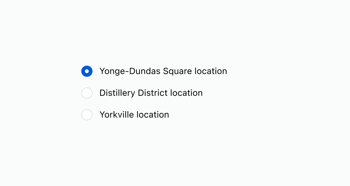
Present options using a choice list component. This example shows a basic choice list for single selection with a pre-selected default.Pick from a set of options
html
Anchor to Enable multiple selectionsEnable multiple selections
Allow customers to select more than one option using checkboxes instead of radio buttons. This example shows a multi-select choice list with descriptive details on each option using the details slot.html
Anchor to Show a validation errorShow a validation error
Display an error message when a required choice hasn't been made. This example shows a choice list with an error message prompting the customer to select an option.html
Anchor to Disable a choice listDisable a choice list
Prevent interaction while keeping the current selection visible. This example shows a disabled choice list with a pre-selected option.html
Anchor to Best practicesBest practices
- Keep labels concise: Write short, scannable labels so customers can quickly compare their choices.
- Add a group label: Use the
labelproperty to describe the purpose of the choice list, such as "Shipping speed" or "Contact method." - Use select for long lists: When you have four or more options and screen space is limited, use select to keep the interface compact and scrollable.