Alerts
Alerts notify merchants of important system information, and provide feedback on merchant actions.
Task alerts
Task alerts are initiated in response to merchant actions during a specific task. Task alerts give merchants direct and immediate feedback.
The following are examples of task alerts:
- A form is successfully submitted.
- There's problem uploading something.
- The information provided is incorrect or doesn't match the requested format.
System alerts
System alerts are initiated by the application or system, independent of merchant actions. System alerts provide updates on background system status or out-of-context events that have finished.
The following are examples of system alerts:
- Lost network connection.
- A planned upgrade.
- The app subscription is expiring soon.
Alert patterns
- Banner (system alert)
- Inline (task alert)
- Toast (task alert)
The following are common patterns available for merchant alerts:
| Pattern | Definition | Duration and interaction | Use to communicate |
|---|---|---|---|
| Banner | Page-level alerts, often system related or contextual alerts that are specific to a card, section, or modal | Banners persist until merchants dismiss them, and can include an action button or link. | |
| Inline | Provides merchants with feedback that's as close to the source as possible | Inline alerts persist until merchants resolve the message. | |
| Toast | Short, temporary messages that slide in and out of a page and provide succinct information. | Toast alerts without actions can disappear automatically or merchants can dismiss them. |
Information
When you use alerts to communicate important information to merchants, you can choose from a few standard patterns.
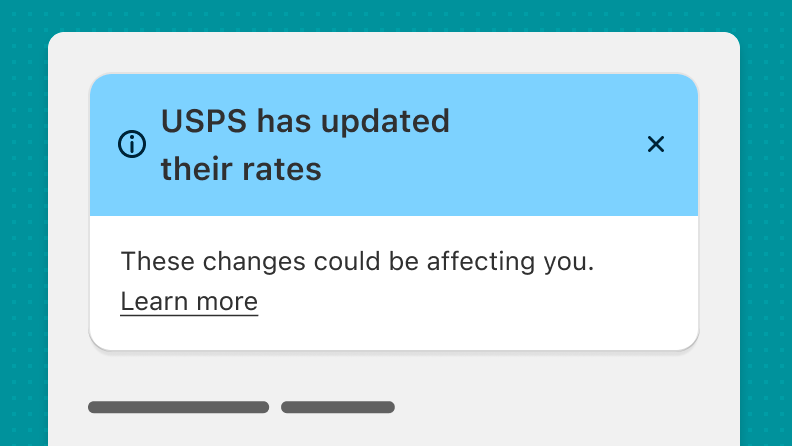
Informational banner
Use an informational banner with the blue header when you want to convey general information or actions that aren't critical.
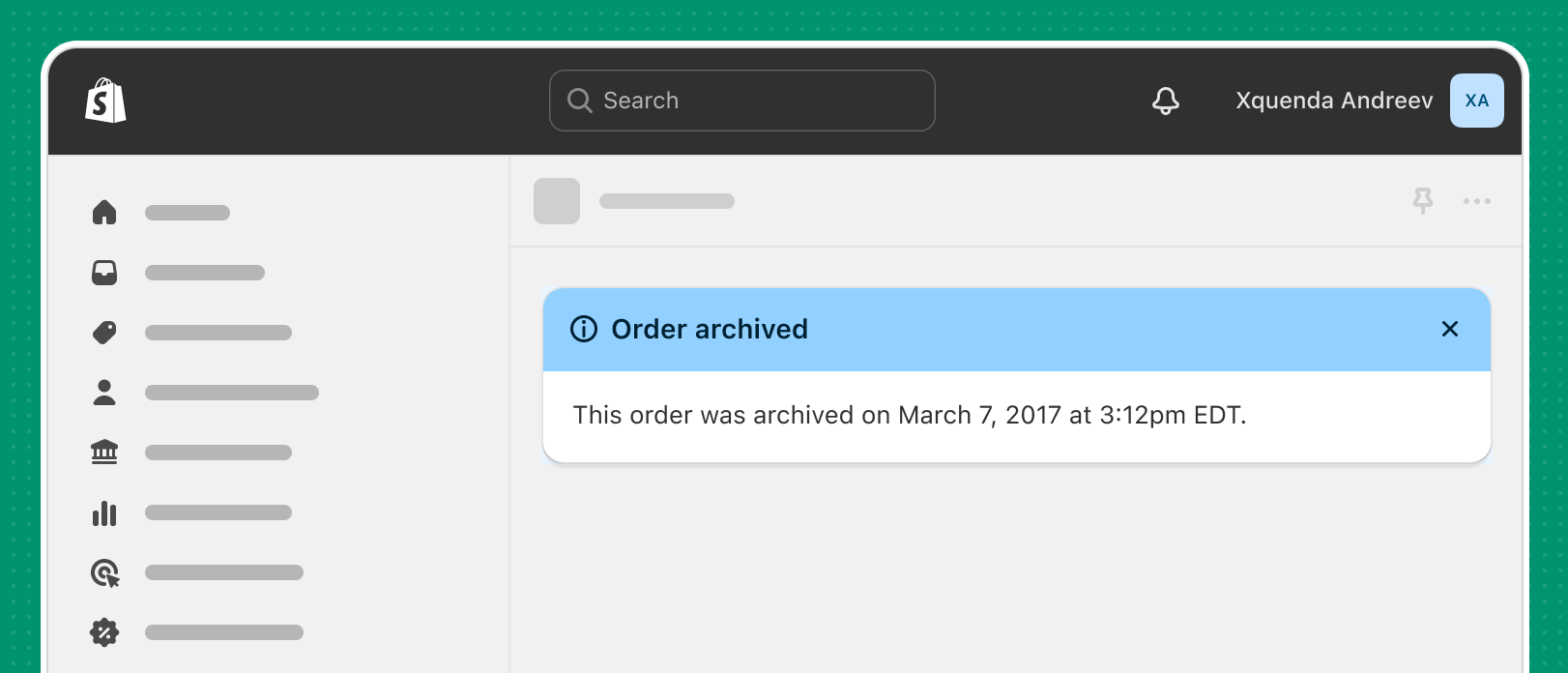
Informational banners should have a blue header and contain only lower priority information that's always dismissible.
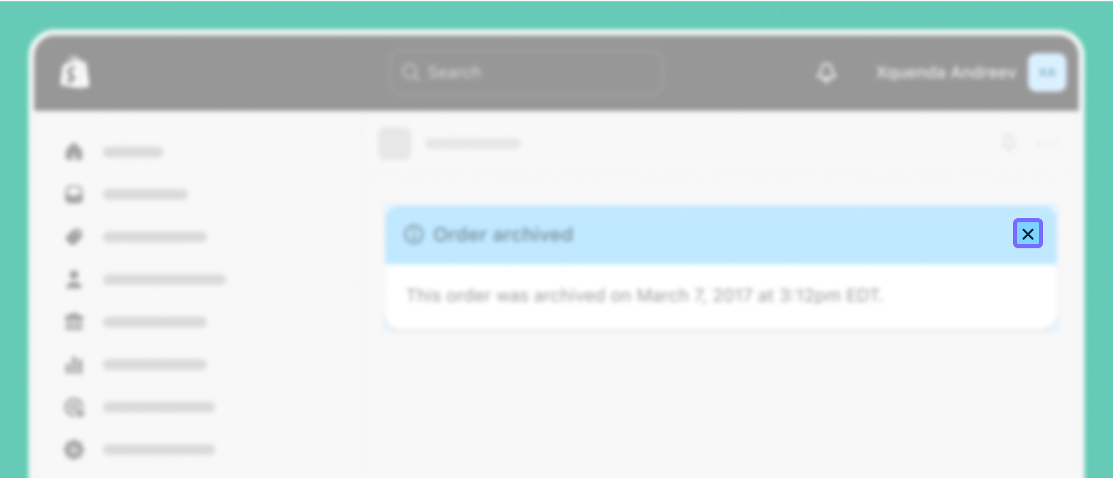
Banners should be dismissible unless they contain critical information that merchants need to resolve to move forward. Dismissed banners shouldn't display again within the same user session.
Success
When you're communicating success, it's important to provide feedback. That means using patterns that inform merchants when a task has been completed successfully.
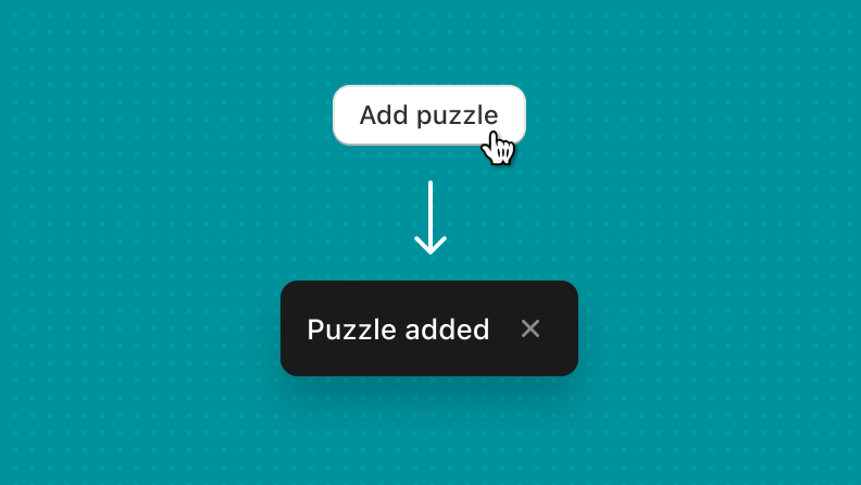
Toast
Toasts inform merchants of a process that the app has performed or will perform. Toasts display temporarily, at the bottom of the interface. Toasts don't require any merchant input to disappear, and they shouldn't interrupt the merchant experience.
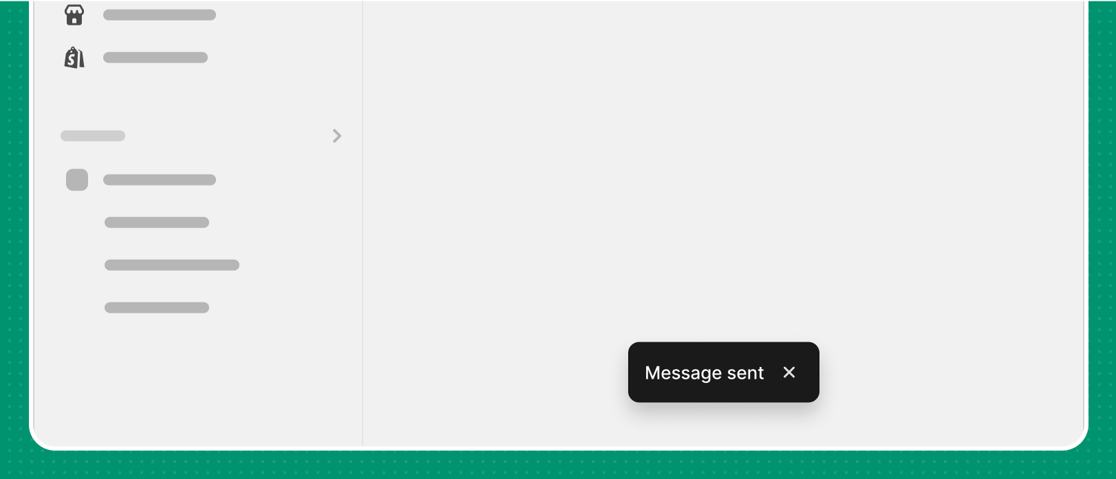
Display toasts in the bottom center of your app screen.
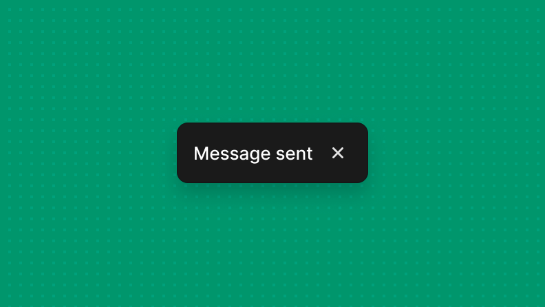
Use toasts for only short messages that confirm an action.
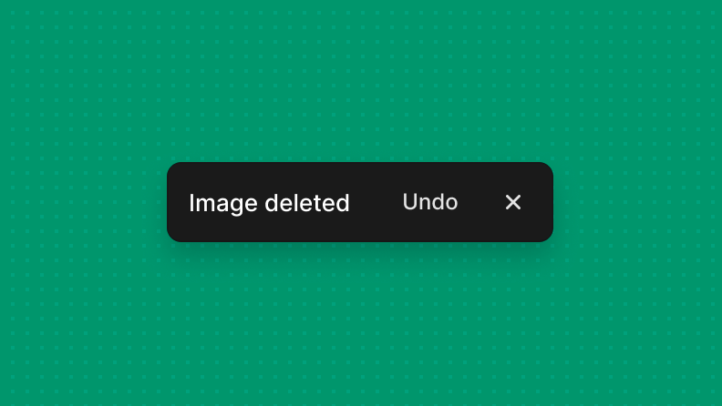
Make toast messages three words or fewer.
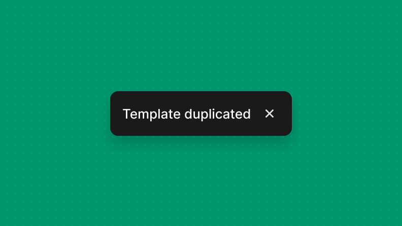
Toasts are only for non-critical messages that are relevant at the moment.
Avoid toasts for error messages, except for persistent errors such as connection errors.
Success banners
Only use success banners when feedback is delayed, persistent, or has a call-to-action (CTA). Otherwise, use toasts.
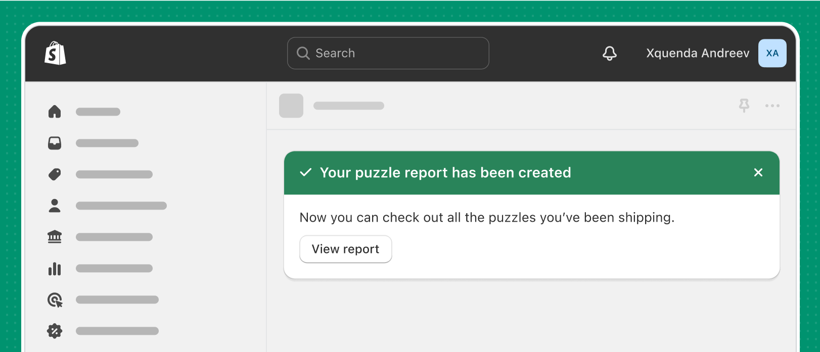
Make success banners green and include next steps, if applicable.
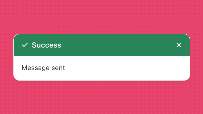
Avoid using banners to show success messages for actions that merchants have completed. For user-initiated feedback, use success toasts instead.
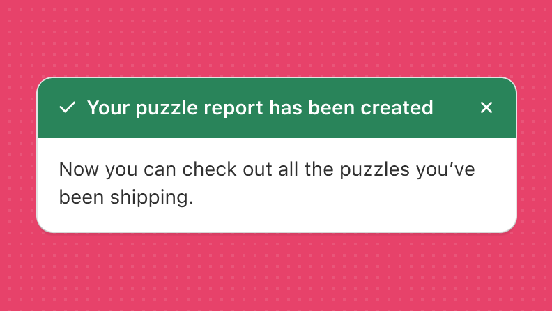
Avoid using success banners if there isn't a CTA.
Warning
When you're communicating warnings to merchants, you have different options based on what's causing the warning.
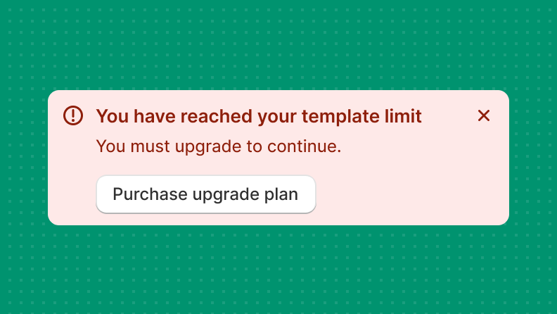
Warning banners
Use warning banners to display information that needs attention or that merchants need to take action on.
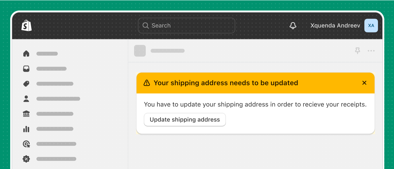
Make warning banners yellow. Seeing these banners can be stressful for merchants, so use them intentionally.
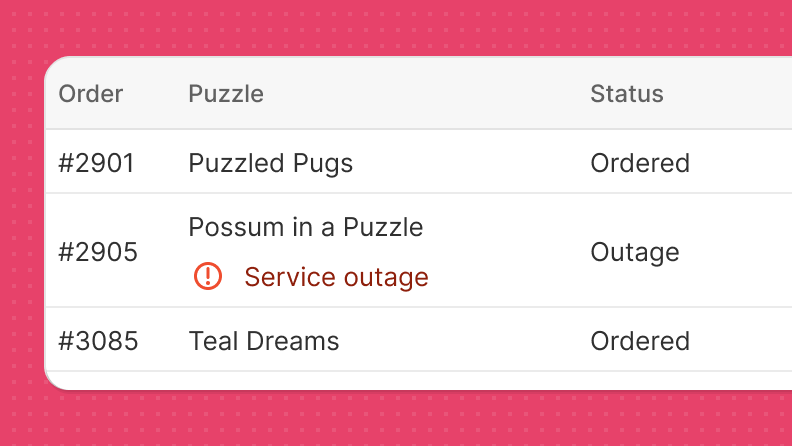
Inline warning in a list
Indicate specific items in a list that you want to make merchants aware of. You can use the badge web component for this.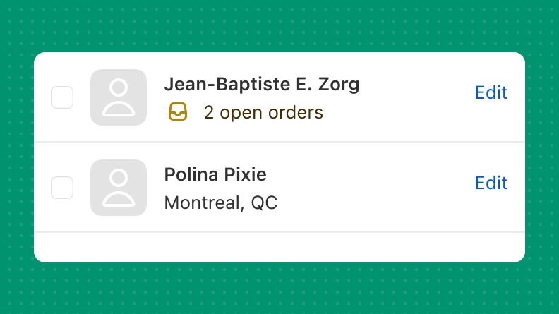
Use inline warnings to draw attention to exceptions in a list, and encourage action when possible.
Avoid only using color to convey a warning. Pair warning messages with a warning icon. This increases accessibility by providing additional identifiers.
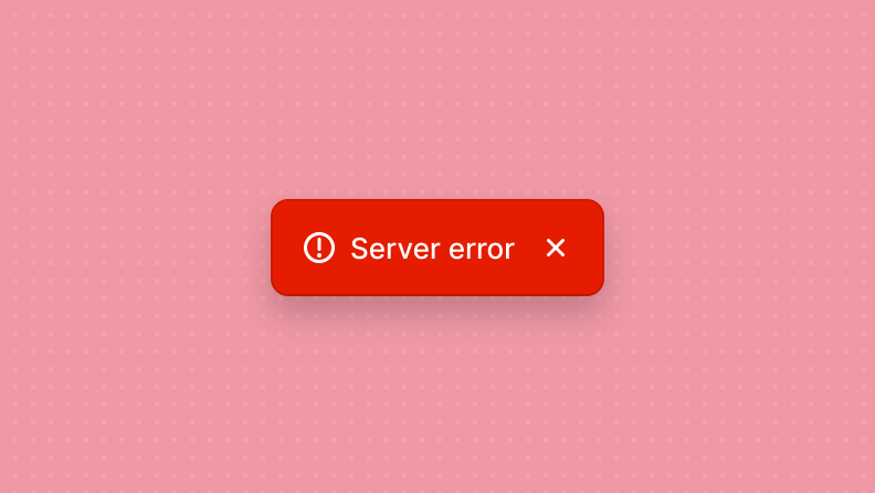
Error
When you're communicating problems and errors, use recognizable patterns that inform merchants of the alert's significance. Put error messages as close to the problem as possible.
Error messages are necessary when something isn't working as expected, or when merchants should be alerted to critical disruptions.
When errors happen, they can be frustrating or even scary. Guide merchants to a solution clearly and quickly.
Make error banners red. Always tell merchants what happened and offer a path forward.
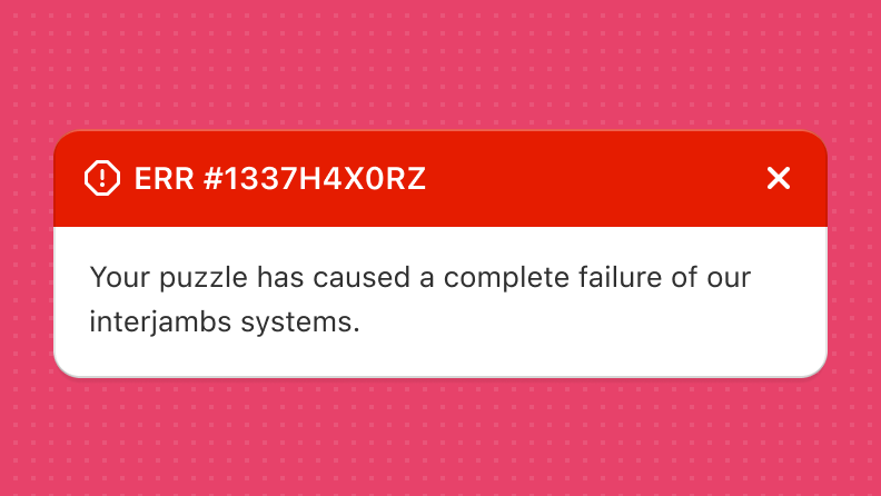
Avoid using scary language, technical terms, and jargon.
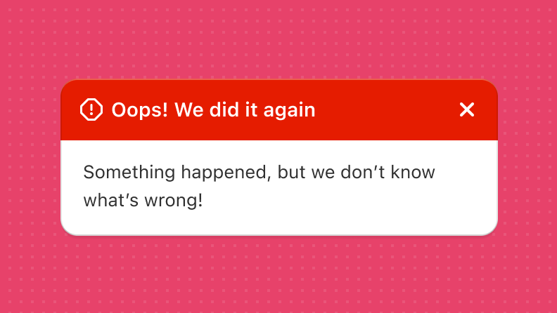
Avoid using humor, idioms, or other words and phrases that might not translate correctly.
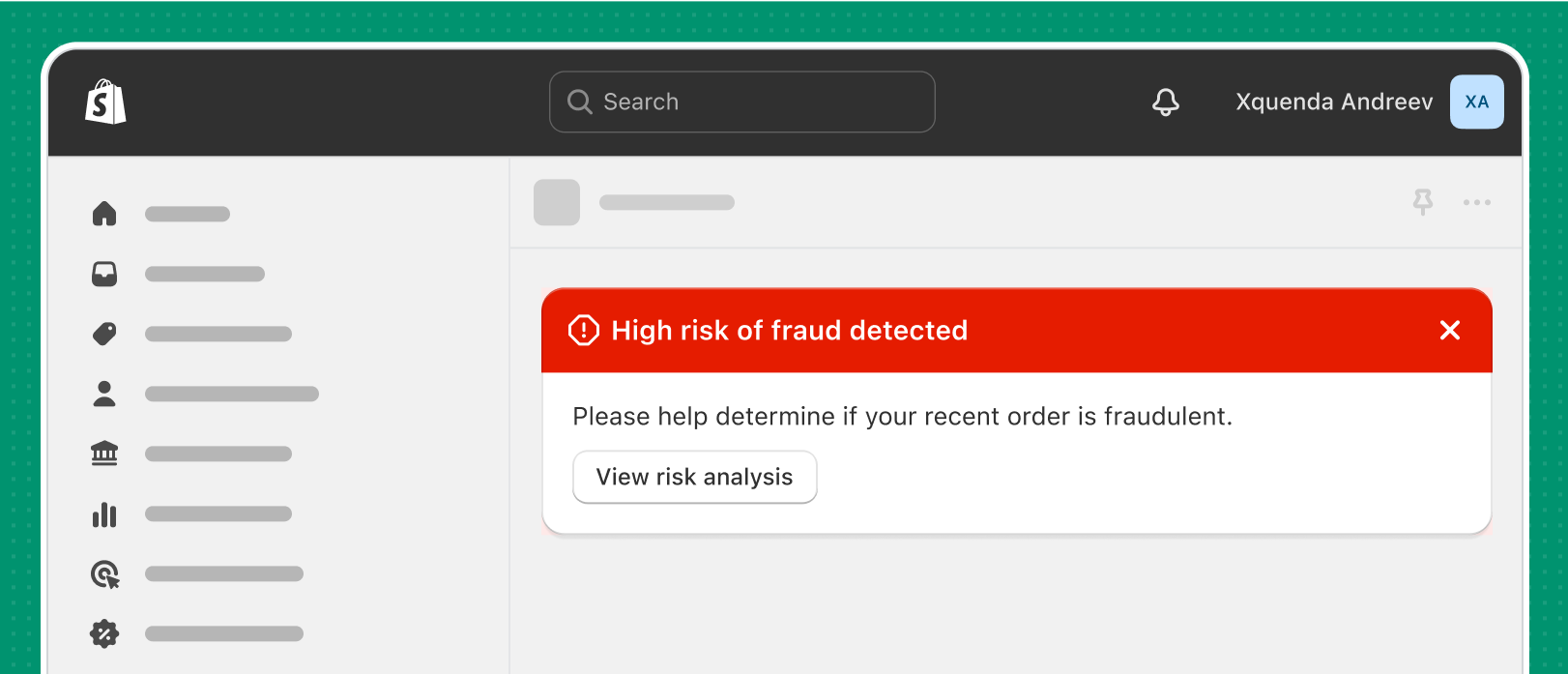
Critical banners
Use critical banners when you're communicating problems that need to be resolved immediately for merchants to complete a task.
Make critical banners red and use them sparingly.
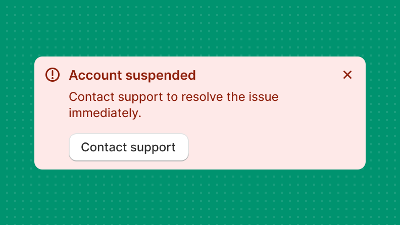
Provide troubleshooting steps and a clear way to get support.
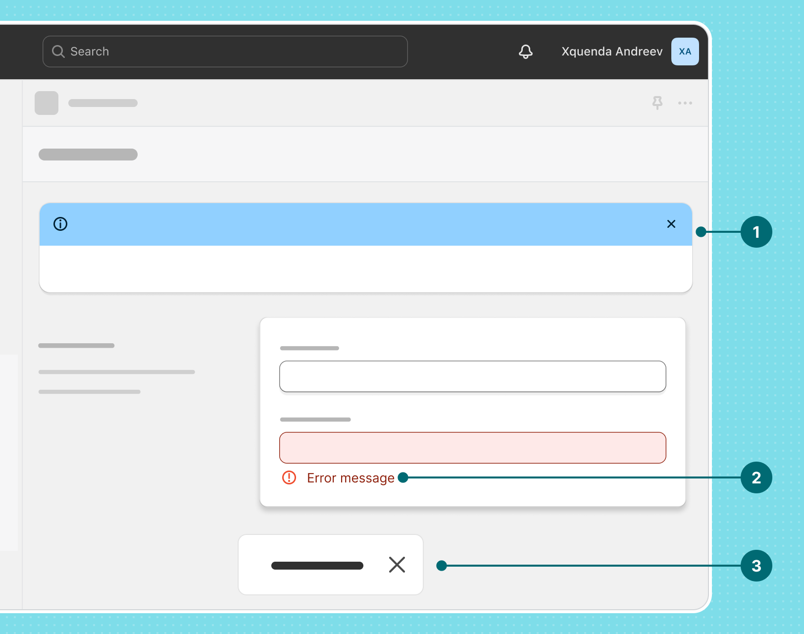
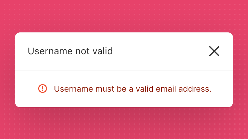
Inline errors in forms
When you're validating form fields like text fields, place the error message directly below the affected field.
Use red for error message text, because it's a common convention outside of Shopify.
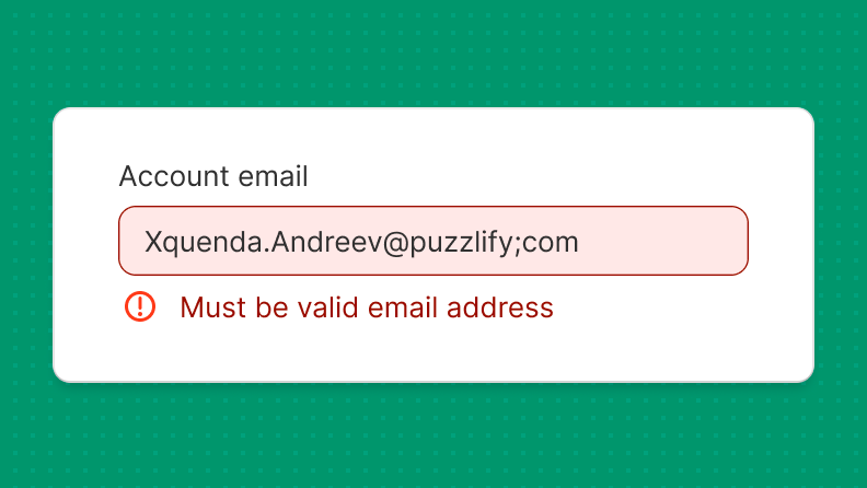
Place error messages directly below the affected field.
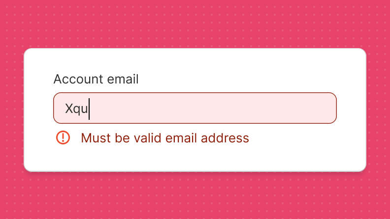
Avoid showing an error while merchants are typing, because it can cause confusion. Wait until the keyboard focus moves away from the field, and then display the error.
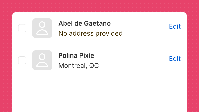
Inline errors in lists
Indicate specific items in a list that you want to make merchants aware of. You can use the badge web component for this.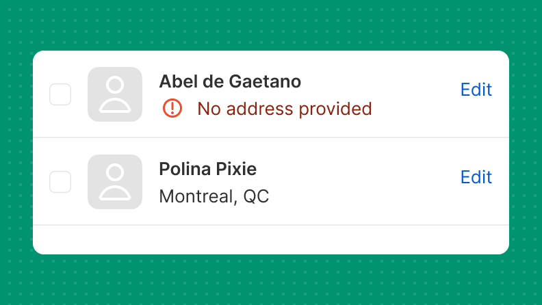
Highlight an exceptional state that encourages merchants to click on a list item. Lead with what went wrong.
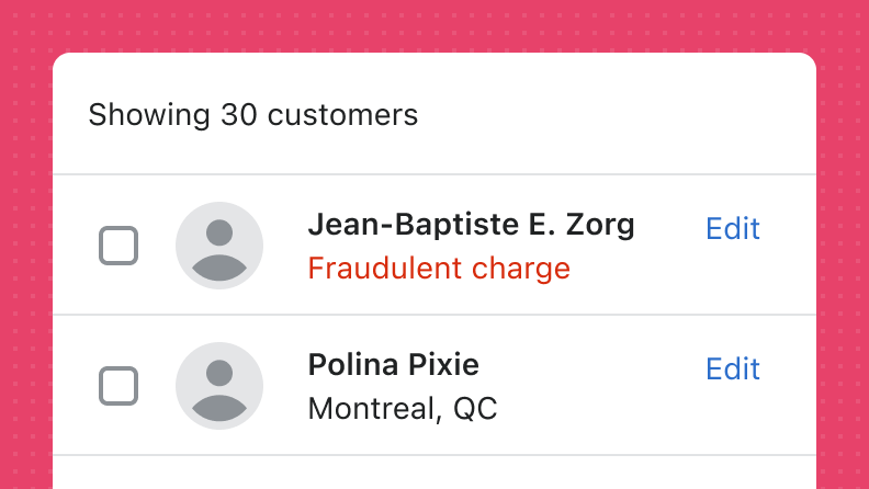
Avoid only using color to convey an error. Instead, pair the error message with an error icon. This increases accessibility by providing additional identifiers.
Errors in cards, sections, or modals
If an error applies to a specific card, section, or modal, then place it near the top of the affected element.
Avoid nesting error messages too deeply within your app's hierarchy. If the error applies more broadly, then place it at the top of the affected element.
Avoid using modals to handle error messages. Only place an error message inside a modal if the modal itself is experiencing an error.