Sheet
The sheet component displays essential information for buyers at the bottom of the screen, appearing above other elements. Use it sparingly to avoid distracting buyers during checkout.
Sheets support a heading, scrollable body content, and action slots for primary and secondary buttons. The library automatically applies the WAI-ARIA Dialog pattern to both the activator and the sheet content.
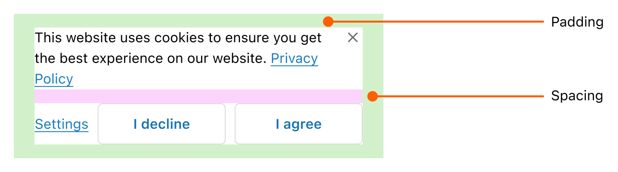
Sheet requires the Customer Privacy capability and renders only in consent-related contexts. Without that capability, the component doesn't appear. Element positions, padding, spacing, and maximum height are controlled by Shopify (see Shopify-controlled surfaces below).
Supported targets
- purchase.
checkout. actions. render-before - purchase.
checkout. block. render - purchase.
checkout. cart-line-item. render-after - purchase.
checkout. cart-line-list. render-after - purchase.
checkout. contact. render-after - purchase.
checkout. delivery-address. render-after - purchase.
checkout. delivery-address. render-before - purchase.
checkout. footer. render-after - purchase.
checkout. header. render-after - purchase.
checkout. payment-method-list. render-after - purchase.
checkout. payment-method-list. render-before - purchase.
checkout. pickup-location-list. render-after - purchase.
checkout. pickup-location-list. render-before - purchase.
checkout. pickup-location-option-item. render-after - purchase.
checkout. pickup-point-list. render-after - purchase.
checkout. pickup-point-list. render-before - purchase.
checkout. reductions. render-after - purchase.
checkout. reductions. render-before - purchase.
checkout. shipping-option-item. details. render - purchase.
checkout. shipping-option-item. render-after - purchase.
checkout. shipping-option-list. render-after - purchase.
checkout. shipping-option-list. render-before - purchase.
thank-you. announcement. render - purchase.
thank-you. block. render - purchase.
thank-you. cart-line-item. render-after - purchase.
thank-you. cart-line-list. render-after - purchase.
thank-you. customer-information. render-after - purchase.
thank-you. footer. render-after - purchase.
thank-you. header. render-after
Supported targets
- purchase.
checkout. actions. render-before - purchase.
checkout. block. render - purchase.
checkout. cart-line-item. render-after - purchase.
checkout. cart-line-list. render-after - purchase.
checkout. contact. render-after - purchase.
checkout. delivery-address. render-after - purchase.
checkout. delivery-address. render-before - purchase.
checkout. footer. render-after - purchase.
checkout. header. render-after - purchase.
checkout. payment-method-list. render-after - purchase.
checkout. payment-method-list. render-before - purchase.
checkout. pickup-location-list. render-after - purchase.
checkout. pickup-location-list. render-before - purchase.
checkout. pickup-location-option-item. render-after - purchase.
checkout. pickup-point-list. render-after - purchase.
checkout. pickup-point-list. render-before - purchase.
checkout. reductions. render-after - purchase.
checkout. reductions. render-before - purchase.
checkout. shipping-option-item. details. render - purchase.
checkout. shipping-option-item. render-after - purchase.
checkout. shipping-option-list. render-after - purchase.
checkout. shipping-option-list. render-before - purchase.
thank-you. announcement. render - purchase.
thank-you. block. render - purchase.
thank-you. cart-line-item. render-after - purchase.
thank-you. cart-line-list. render-after - purchase.
thank-you. customer-information. render-after - purchase.
thank-you. footer. render-after - purchase.
thank-you. header. render-after
Anchor to Use casesUse cases
- Cookie consent: Present cookie preferences with accept, reject, and learn-more actions in a non-intrusive bottom panel.
- Privacy disclosures: Display privacy policy summaries with acknowledgment actions before buyers complete checkout.
- Data collection notices: Inform buyers about what personal data you collect and how it's used.
- Consent management: Let buyers toggle specific consent categories like analytics, marketing, and essential cookies.
Anchor to PropertiesProperties
Configure the following properties on the sheet component.
- Anchor to accessibilityLabelaccessibility
Labelaccessibility Label stringstring A label that describes the purpose of the sheet, announced by assistive technologies. When set, screen readers will use this label instead of the
headingto describe the sheet.- Anchor to defaultOpendefault
Opendefault Open booleanbooleanDefault: falseDefault: false Whether the sheet should be open when it first renders. Use sparingly — only when the user must interact with the sheet before proceeding (for example, a privacy consent prompt). Only takes effect on the initial render.
- Anchor to headingheadingheadingstringstring
A title that describes the content of the sheet.
- Anchor to idididstringstring
A unique identifier for the element. Use this to reference the element in JavaScript, link labels to form controls, or target specific elements for styling or scripting.
Anchor to EventsEvents
The sheet component provides event callbacks for handling user interactions. Learn more about handling events.
- Anchor to afterhideafterhideafterhideCallbackEventListener<typeof tagName>CallbackEventListener<typeof tagName>
A callback fired when the sheet is hidden, after any hide animations have completed.
- Anchor to aftershowaftershowaftershowCallbackEventListener<typeof tagName>CallbackEventListener<typeof tagName>
A callback fired when the sheet is shown, after any show animations have completed.
- Anchor to hidehidehideCallbackEventListener<typeof tagName>CallbackEventListener<typeof tagName>
A callback fired immediately after the sheet is hidden.
- Anchor to showshowshowCallbackEventListener<typeof tagName>CallbackEventListener<typeof tagName>
A callback fired immediately after the sheet is shown.
CallbackEventListener
A typed event listener for custom element events. The listener receives a `CallbackEvent` with the correct `currentTarget` type for the associated custom element tag.
(EventListener & {
    (event: CallbackEvent<TTagName, Event> & TData): void;
}) | null
CallbackEvent
An event type that narrows the `currentTarget` to the specific HTML element associated with the custom element tag. This provides type-safe event handling in callback listeners.
TEvent & {
    currentTarget: HTMLElementTagNameMap[TTagName];
}
Anchor to SlotsSlots
The sheet component supports slots for additional content placement within the component. Learn more about using slots.
- Anchor to primary-actionprimary-actionprimary-actionHTMLElementHTMLElement
The main action button displayed in the sheet footer, representing the primary action users should take. Only accepts a single button component.
- Anchor to secondary-actionssecondary-actionssecondary-actionsHTMLElementHTMLElement
Additional action buttons displayed in the sheet footer, providing alternative or supporting actions.
Anchor to MethodsMethods
The sheet component exposes methods for programmatic control. Learn more about using methods.
- Anchor to hideOverlayhide
Overlayhide Overlay () => void() => voidrequiredrequired A method to programmatically hide the overlay and run any associated hide animations.
Anchor to ExamplesExamples
Anchor to Show a consent noticeShow a consent notice
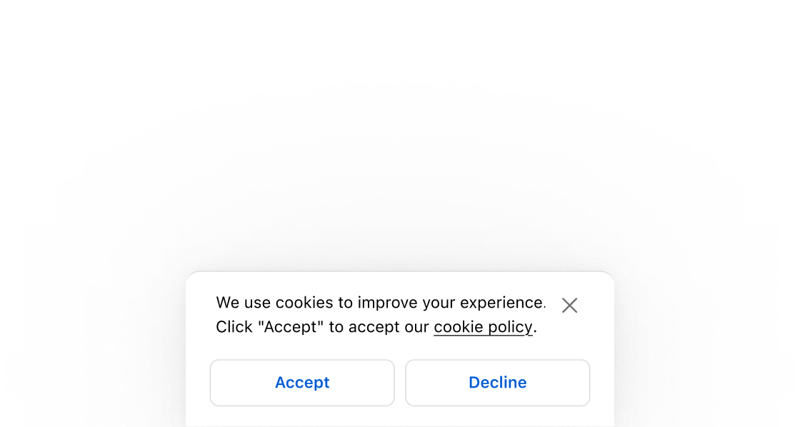
Display a consent notice at the bottom of the checkout page. This example shows a sheet with a heading, an accessibilityLabel, and body text.Show a consent notice
html
Let buyers manage cookie preferences with clear choices. This example places a save button in the
primary-action slot and reject and learn-more buttons in secondary-actions, with an accessibilityLabel for screen readers.html
Anchor to Display a privacy policy summaryDisplay a privacy policy summary
Show a privacy policy summary that buyers can review and confirm. This example includes body text and a confirm button that closes the sheet after the buyer reads the policy.html
Anchor to Best practicesBest practices
- Use sparingly: Reserve sheets for consent and privacy scenarios. Overusing them distracts buyers during checkout.
- Reserve for content that requires acknowledgment: Sheets work best when buyers need to actively respond before continuing, not for passive informational content.
- Limit to one sheet at a time: Don't stack multiple sheets. If the workflow requires more than one decision, combine them or use a modal for the additional step.
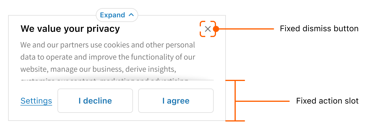
- Keep content concise: Use short content, small text sizes, or remove the header to avoid scrolling. When content exceeds the maximum height, the heading and content become scrollable while the actions slot and dismiss button remain fixed.
- Include clear actions: Use the
primary-actionslot for the main decision andsecondary-actionsfor alternatives like "Reject all" or "Learn more." Theprimary-actionslot supports up to two buttons, and thesecondary-actionsslot supports one button. Keep button labels brief so they don't wrap to more than one line. - Provide an accessibility label: Use
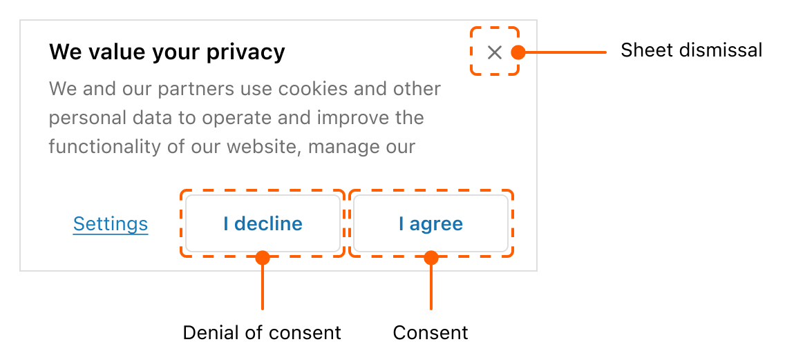
accessibilityLabelwhen the sheet heading alone doesn't fully describe the purpose for buyers using assistive technology. - Handle all consent outcomes: Account for consent, denial, and dismissal. When a buyer accepts, cookies load and the sheet doesn't re-appear. When a buyer rejects, cookies don't load and the sheet doesn't re-appear. When a buyer dismisses without a decision, cookies don't load and the sheet re-appears on the next visit.
Anchor to Shopify-controlled surfacesShopify-controlled surfaces
To prevent disruptions during checkout, we maintain strict design control over key areas of the sheet component. These Shopify-controlled elements include:
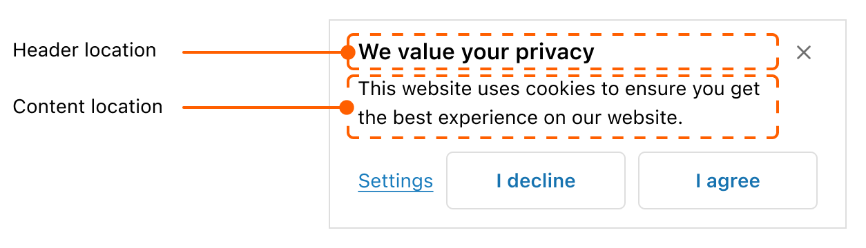
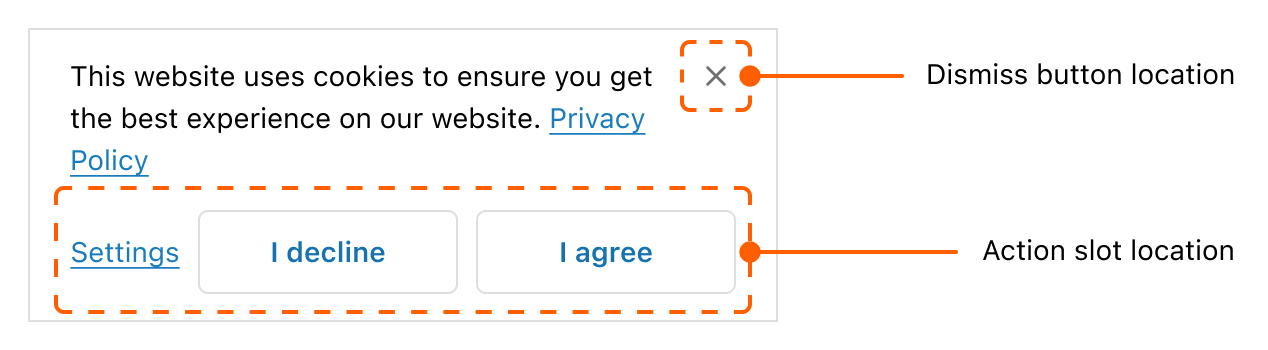
Locations of elements
The sheet elements (header, content, action buttons, and dismiss button) are strategically positioned and sized to present vital information upfront.
Padding and spacing
Maximum height
To balance buyer attention and task completion, a maximum height is set for the sheet component.
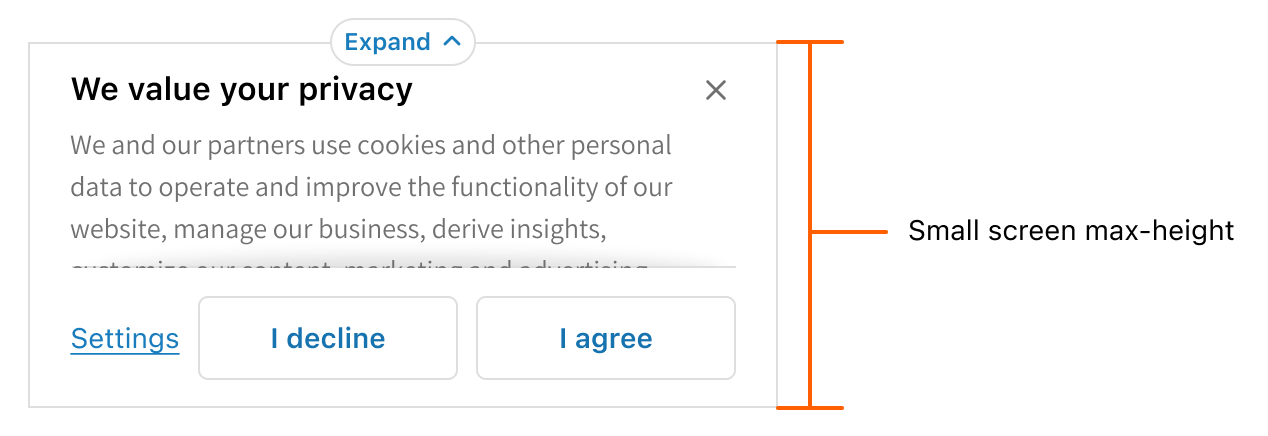
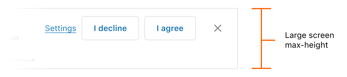
When content pushes the sheet to exceed this limit, the following UI behaviors are triggered:
Heading and content are scrollable

Expand pill appears to allow buyers to view the entire content
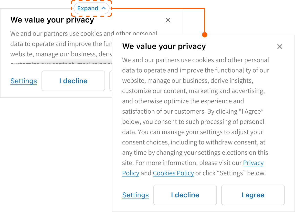
Actions slot and dismiss button remain fixed
Anchor to Privacy consent requirementsPrivacy consent requirements
Content
For the best buyer experience, ensure content is brief and to the point.
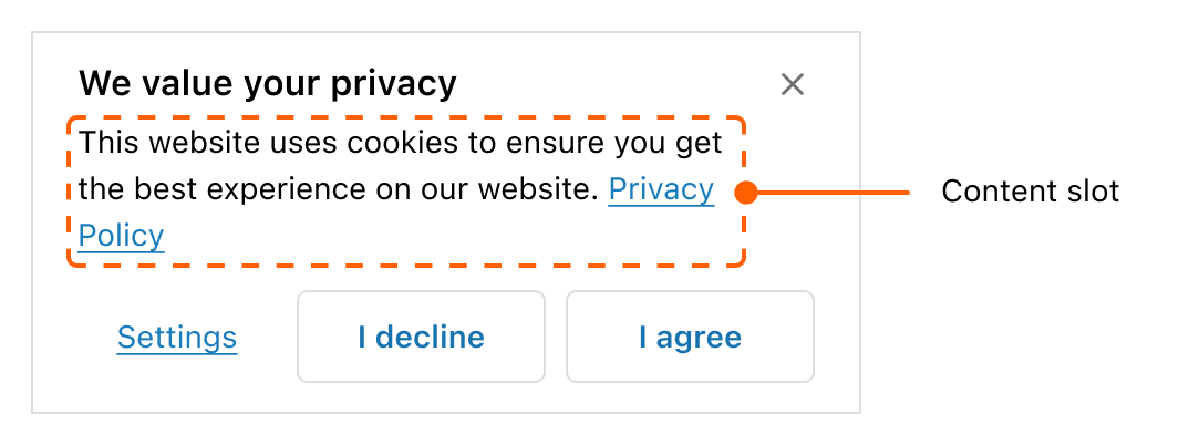
Various strategies can be employed to avoid content scrolling.
Use short content

Use small text size

Remove the header

Actions slot
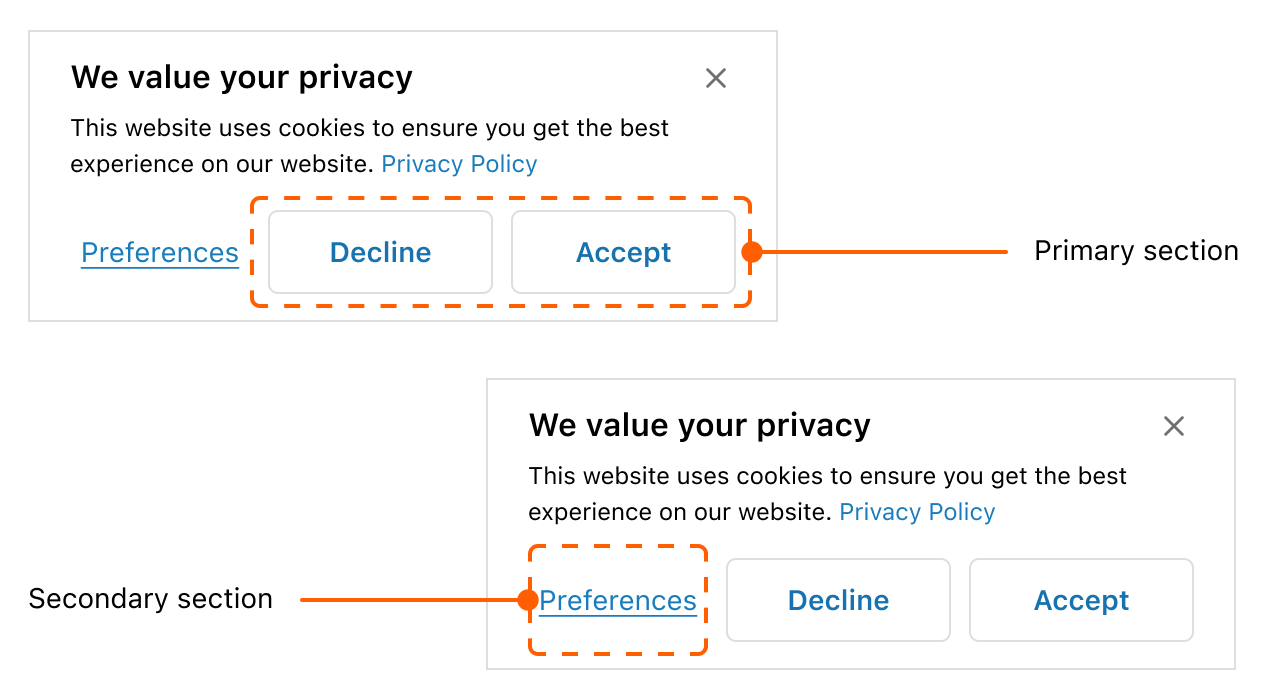
The actions slot allows buyers to make decisions and is split into primary and secondary sections.
Primary section
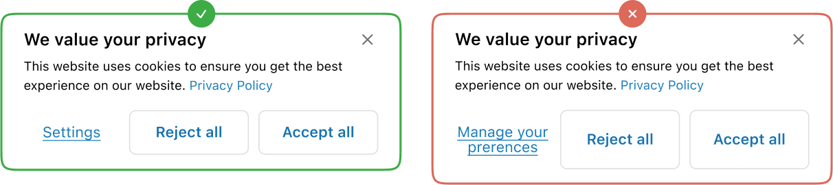
Contains primary actions for buyer decisions on the sheet's prompt. Up to two buttons are allowed. Keep the button's content brief so that it doesn't wrap to more than one line.
Secondary section
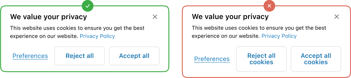
Contains action that is unrelated to the sheet's prompt. Only one button is allowed. A modal can be activated when engaging with the secondary action. Keep the button's content brief so that it doesn't wrap to more than one line.
Consent, denial of consent, and sheet dismissal
Consent
When a buyer expresses consent by pressing the acceptance button, cookies load and the sheet doesn't re-appear on refresh.
Denial of consent
When a buyer expresses denial of consent by pressing the rejection button, cookies don't load and the sheet doesn't re-appear on refresh.
Sheet dismissal
When a buyer neither grants nor denies consent by pressing the dismiss button, cookies don't load and the sheet re-appears on refresh.