Input settings
Input settings can hold a value and are configurable by merchants.
Input settings are generally composed of standard attributes, and there are two categories:
To learn how to access the values of these settings for use in your theme, refer to the settings overview.
If you want to add informational elements to your settings display, like a heading, then refer to Sidebar settings.
If you want to add informational elements to your settings display, like a heading, then refer to Sidebar settings.
Whether a setting's value can be translated into a store's other languages depends on the setting type:
- Text-bearing settings (
text,textarea,richtext,inline_richtext, andhtml): merchants can translate their content with Translate & Adapt. liquidsettings: the stored value isn't available in Translate & Adapt, which makes this type a good choice for language-neutral values like a CSS class name or app integration code. (The Liquid can still produce locale-dependent output at render time, for example throughlocalization.languageor translation filters.)
Translating a setting's value is separate from translating its schema attributes (labels, info, options). For more information, refer to Translate settings.
Anchor to Standard attributesStandard attributes
The following are standard attributes across input settings. However, depending on the input type, there might be extra attributes or some might not apply:
| Attribute | Description | Required |
|---|---|---|
type | The setting type, which can be any of the basic or specialized input setting types. | Yes |
id | The setting ID, which is used to access the setting value. | Yes |
label | The setting label, which will show in the theme editor. | Yes |
default | The default value for the setting. | No |
info | An option for informational text about the setting. | No |
Anchor to Basic input settingsBasic input settings
The following are the basic input setting types:
Anchor to [object Object]checkbox
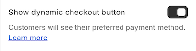
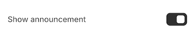
checkboxA setting of type checkbox outputs a checkbox field. This setting type can be used for toggling features on and off, such as whether to show an announcement bar.
For example, the following setting generates the following output:
Setting
Output
When accessing the value of a checkbox type setting, data is returned as a boolean.
If default is unspecified, then the value is false by default.
If default is unspecified, then the value is false by default.
A setting of type number outputs a single number field. In addition to the standard attributes of an input setting, number type settings have the following attribute:
| Attribute | Description | Required |
|---|---|---|
placeholder | A placeholder value for the input. These values only appear for settings defined in settings_schema.json. They don't appear for settings
defined in a section's schema. | No |
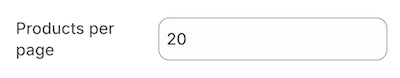
You can use this setting type to capture a varying numerical value, such as the number of products to show per page on a collection page.
For example, the following setting generates the following output:
Setting
Output
When accessing the value of a number type setting, data is returned in one of the following formats:
The default attribute is optional. However, the value must be a number and not a string. Failing to adhere results in an error.
The default attribute is optional. However, the value must be a number and not a string. Failing to adhere results in an error.
A setting of type radio outputs a radio option field. In addition to the standard attributes of an input setting, radio type settings have a required options attribute that accepts an array of value and label definitions.
You can use this setting type to capture a multi-option selection, such as the alignment of a header logo.
For example, the following setting generates the following output:
Setting
Output

When accessing the value of a radio type setting, data is returned as a string.
If default is unspecified, then the first option is selected by default.
If default is unspecified, then the first option is selected by default.
A setting of type range outputs a range slider field with an input field. In addition to the standard attributes of an input setting, range type settings have the following attributes:
| Attribute | Description | Required |
|---|---|---|
min | The minimum value of the input | Yes |
max | The maximum value of the input | Yes |
step | The increment size between steps of the slider. Defaults to 1 when omitted. | No |
unit | The unit for the input. For example, you can set px for a font-size slider. | No |
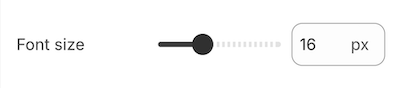
You can use this setting type to capture a varying numerical value, such as font size.
You can update the range value using the provided slider, or by typing a value into the input field:
- If you enter a value that doesn't respect the
stepdefinition, then the value rounds to the closest step. - If you enter a value outside of the given
minandmax, then the value reverts to theminormaxvalue accordingly.
For example, the following setting generates the following output:
Setting
Output
When accessing the value of a range type setting, data is returned as a number.
The default attribute is required. The min, max, step, and default attributes can't be string values. Failing to adhere results in an error.
The default attribute is required. The min, max, step, and default attributes can't be string values. Failing to adhere results in an error.
A setting of type select outputs different selector fields, depending on certain criteria. In addition to the standard attributes of an input setting, select type settings have the following attributes:
| Attribute | Description | Required |
|---|---|---|
options | Takes an array of value/label definitions for each option in the drop-down. | Yes |
group | An optional attribute that you can add to each option to create option groups in the drop-down. | No |
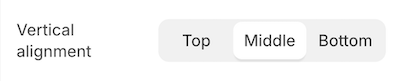
Anchor to Selector fieldsSelector fields
The following criteria render selector fields as either a DropDown or a SegmentedControl:
| Field | Rendering criteria | Output | ||
|---|---|---|---|---|
Dropdown |
|  | ||
SegmentedControl |
|  |
| |
You can use this setting type to capture a multi-option selection, such as the vertical alignment of slideshow text.
For example, the following setting generates the following output:
Setting
Output
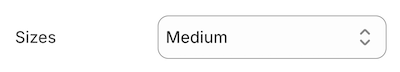
However, if your setting matches the criteria for a drop-down field (DropDown) because it has more than five options, then the following output is generated:
Setting
Output
When accessing the value of a select type setting, data is returned as a string.
If default is unspecified, then the first option is selected by default.
If default is unspecified, then the first option is selected by default.
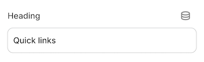
A setting of type text outputs a single-line text field. In addition to the standard attributes of an input setting, text type settings have the following attribute:
| Attribute | Description | Required |
|---|---|---|
placeholder | A placeholder value for the input. These values only appear for settings defined in settings_schema.json. They don't appear for settings
defined in a section's schema. | No |
You can use this setting type to capture short strings, such as titles.
For example, the following setting generates the following output:
Setting
Output
When accessing the value of a text type setting, data is returned in one of the following formats:
- A string.
- An
emptyobject, if nothing has been entered.
Settings of type text are not updated when switching presets.
Settings of type text are not updated when switching presets.
Anchor to [object Object]textarea
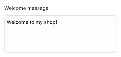
textareaA setting of type textarea outputs a multi-line text field. In addition to the standard attributes of an input setting, textarea type settings have the following attribute:
| Attribute | Description | Required |
|---|---|---|
placeholder | A placeholder value for the input. These values only appear for settings defined in settings_schema.json. They don't appear for settings
defined in a section's schema. | No |
You can use this setting type to capture larger blocks of text, such as messages.
For example, the following setting generates the following output:
Setting
Output
When accessing the value of a textarea type setting, data is returned in one of the following formats:
- A string.
- An
emptyobject, if nothing has been entered.
Anchor to Specialized input settingsSpecialized input settings
The following are the specialized input setting types:
- article
- article_list
- blog
- collection
- collection_list
- color
- color_background
- color_palette
- color_scheme
- color_scheme_group
- font_picker
- html
- image_picker
- inline_richtext
- link_list
- liquid
- metaobject
- metaobject_list
- page
- product
- product_list
- richtext
- text_alignment
- url
- video
- video_url
Anchor to [object Object]article
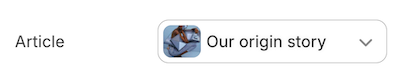
articleA setting of type article outputs an article picker field that's automatically populated with the available articles for the store. You can use this setting type to capture an article selection, such as the article to feature on the homepage.
For example, the following setting generates the following output:
Setting
Output
When accessing the value of an article type setting, data is returned in one of the following formats:
- An
articleobject.
To ensure backwards compatibility with legacy resource-based settings, outputting the setting directly will return the object's handle.
blankif no selection has been made, the selection isn't visible, or the selection no longer exists
Settings of type article are not updated when switching presets. article settings also don't support the default attribute.
Settings of type article are not updated when switching presets. article settings also don't support the default attribute.
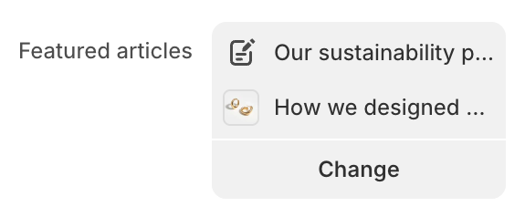
Anchor to [object Object]article_list
article_listA setting of type article_list outputs an article picker field that's automatically populated with the available blog articles for the store. You can use this setting type to capture multiple articles, such as a group of articles to feature on the homepage.
You can only choose from articles that are published.
You can only choose from articles that are published.
In addition to the standard attributes of an input setting, article_list type settings have the following attributes:
| Attribute | Description | Required |
|---|---|---|
limit | The maximum number of articles that the merchant can select. The default limit, and the maximum limit you can set, is 50. | No |
Setting
Output
When accessing the value of an article_list type setting, data is returned in one of the following formats:
- An array of
articleobjects
The array supports pagination using the paginate tag. You can also append .count to the setting key to return the number of articles in the array.
blankif no selection has been made, the selection isn't visible, or the selection no longer exists
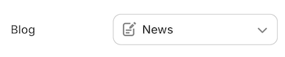
A setting of type blog outputs a blog picker field that's automatically populated with the available blogs for the store. You can use this setting type to capture a blog selection, such as the blog to feature in the sidebar.
For example, the following setting generates the following output:
Setting
Output
When accessing the value of a blog type setting, data is returned in one of the following formats:
- A
blogobject.
To ensure backwards compatibility with legacy resource-based settings, outputting the setting directly will return the object's handle.
blank, if either no selection has been made or the selection no longer exists.
Settings of type blog are not updated when switching presets. blog settings also don't support the default attribute.
Settings of type blog are not updated when switching presets. blog settings also don't support the default attribute.
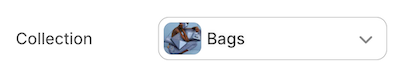
Anchor to [object Object]collection
collectionA setting of type collection outputs a collection picker field that's automatically populated with the available collections for the store. You can use this setting type to capture a collection selection, such as a collection for featuring products on the homepage.
For example, the following setting generates the following output:
Setting
Output
When accessing the value of a collection type setting, data is returned in one of the following formats:
To ensure backwards compatibility with legacy resource-based settings, outputting the setting directly will return the object's handle.
blank, if no selection has been made, the selection isn't visible, or the selection no longer exists.
Settings of type collection are not updated when switching presets. collection settings also don't support the default attribute.
Settings of type collection are not updated when switching presets. collection settings also don't support the default attribute.
Anchor to [object Object]collection_list
collection_listA setting of type collection_list outputs a collection picker field that's automatically populated with the available collections for the store. You can use this setting type to capture multiple collections, such as a group of collections to feature on the homepage.
In addition to the standard attributes of an input setting, collection_list type settings have the following attributes:
| Attribute | Description | Required |
|---|---|---|
limit | The maximum number of collections that the merchant can select. The default limit, and the maximum limit you can set, is 50. | No |
Setting
Output
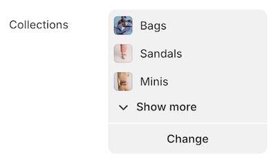
Output
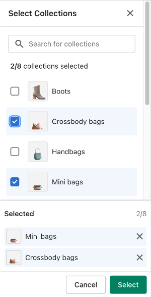
When accessing the value of a collection_list type setting, data is returned in one of the following formats:
- An array of
collectionobjects
The array supports pagination using the paginate tag. You can also append .count to the setting key to return the number of collections in the array.
blankif no selection has been made, the selection isn't visible, or the selection no longer exists
A setting of type color outputs a color picker field. In addition to the standard attributes of an input setting, color type settings have the following attribute:
| Attribute | Description | Required |
|---|---|---|
placeholder | A placeholder value shown in the picker when no color is set. Use this to hint at the intended color role, for example "Default" or "Inherited". | No |
You can use this setting type to capture a color selection for various theme elements, such as the body text color. The placeholder attribute displays custom text when no color is set, without affecting the stored value.
For example, the following setting generates the following output:
Setting
Output
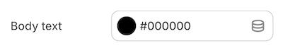
When accessing the value of a color type setting, data is returned in one of the following formats:
- A
colorobject. blank, if no selection has been made.
If default is omitted, merchants see a Clear option in the editor. Clearing stores "" in settings_data.json and returns blank in Liquid. An unset color is visually distinct from transparent (#00000000).
If your theme defines a color_palette, you can use a palette color as the default value:
Setting with palette default
Anchor to [object Object]color_background
color_backgroundA setting of type color_background outputs a text field for entering CSS background properties. You can use this setting type to capture background settings for various theme elements, such as the store background.
Settings of type color_background do not support image related background properties.
Settings of type color_background do not support image related background properties.
For example, the following setting generates the following output:
Setting
Output
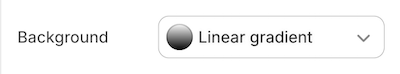
When accessing the value of a color_background type setting, data is returned in one of the following formats:
- A string.
- An empty string, if nothing has been entered.
If your theme defines a color_palette, you can use palette colors as the default value. Palette references can be embedded inside gradient strings:
Setting with palette references
Anchor to [object Object]color_palette
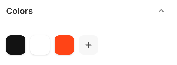
color_paletteA setting of type color_palette defines a set of named colors available across your theme's color and color_background settings. Merchants see these colors in a grid in the theme editor and can pick from them when adjusting any color setting.
You can add only one color_palette per theme, and it must be in settings_schema.json. The default object defines the theme's starting palette. Any changes a merchant makes in the theme editor are stored in settings_data.json and take precedence over the defaults.
Unlike most input settings, color_palette supports only the id standard attribute, which is required. The label, info, and visible_if attributes aren't supported. It has the following additional attribute:
| Attribute | Description | Required |
|---|---|---|
default | An object of key-value pairs defining the palette colors. Keys must
start with a letter and can contain letters, digits, and underscores.
Values must be valid hex colors without an alpha channel
(for example, #FFF or #FF4416). Eight-digit
hex values with alpha aren't supported. At least two entries are
required. | Yes |
A palette supports between 2 and 20 colors. Colors are returned in the order they appear in the JSON.
For example, the following setting generates the following output:
Setting
Output
When accessing the value of a color_palette type setting, you access individual palette colors through settings.<id>, where <id> matches the id you defined in the schema. Each color is returned as a color object with full access to color properties and filters.
Access by key
Iterating over the palette yields each color as a color object in JSON key order. Keys aren't available during iteration, only the color values:
Iterate over all palette colors
Anchor to Cross-setting referencesCross-setting references
You can use a palette color as the default value of a color or color_background setting. The value must be a Liquid output tag that references a palette key, for example {{ settings.colors.primary }}. Only color_palette access paths are supported as dynamic defaults. See the color and color_background sections for examples.
Anchor to Theme updatesTheme updates
When a theme update adds new keys to the palette default, those keys appear automatically in the merchant's palette. Merchant-customized values are preserved and take precedence over new defaults.
Anchor to Deleting palette colorsDeleting palette colors
When a merchant deletes a palette color in the theme editor, Shopify asks them to choose a replacement. The deleted color's value is stored as a reference to the replacement, for example {{ settings.colors.accent }}. This keeps all existing references intact without updating every template that uses the deleted color.
Anchor to [object Object]color_scheme
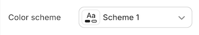
color_schemeA setting of type color_scheme outputs a picker with all of the available theme color schemes, and a preview of the selected color scheme. Theme color schemes in the picker are defined using the color_scheme_group setting.
You can apply a color scheme to sections, blocks and general theme settings. Color scheme settings aren't supported in app blocks.
For example, the following setting generates the following output:
Setting
Output
When accessing the value of a color_scheme type setting, Shopify returns the selected color_scheme object from color_scheme_group.
If no value was entered, or the value was invalid, then the default value from color_scheme is returned. If the default value is also invalid, then the first color_scheme from color_scheme_group is returned.
If the theme doesn't have color_scheme_group data in settings_data.json, then nil is returned.
Anchor to [object Object]color_scheme_group
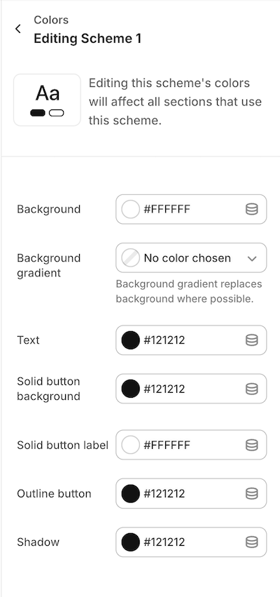
color_scheme_groupA setting of type color_scheme_group outputs a color scheme which is composed of the following input setting types:
headercolorcolor_background
Color schemes can be added only in settings_schema.json.
For example, the following setting generates the following output:
Setting
Output
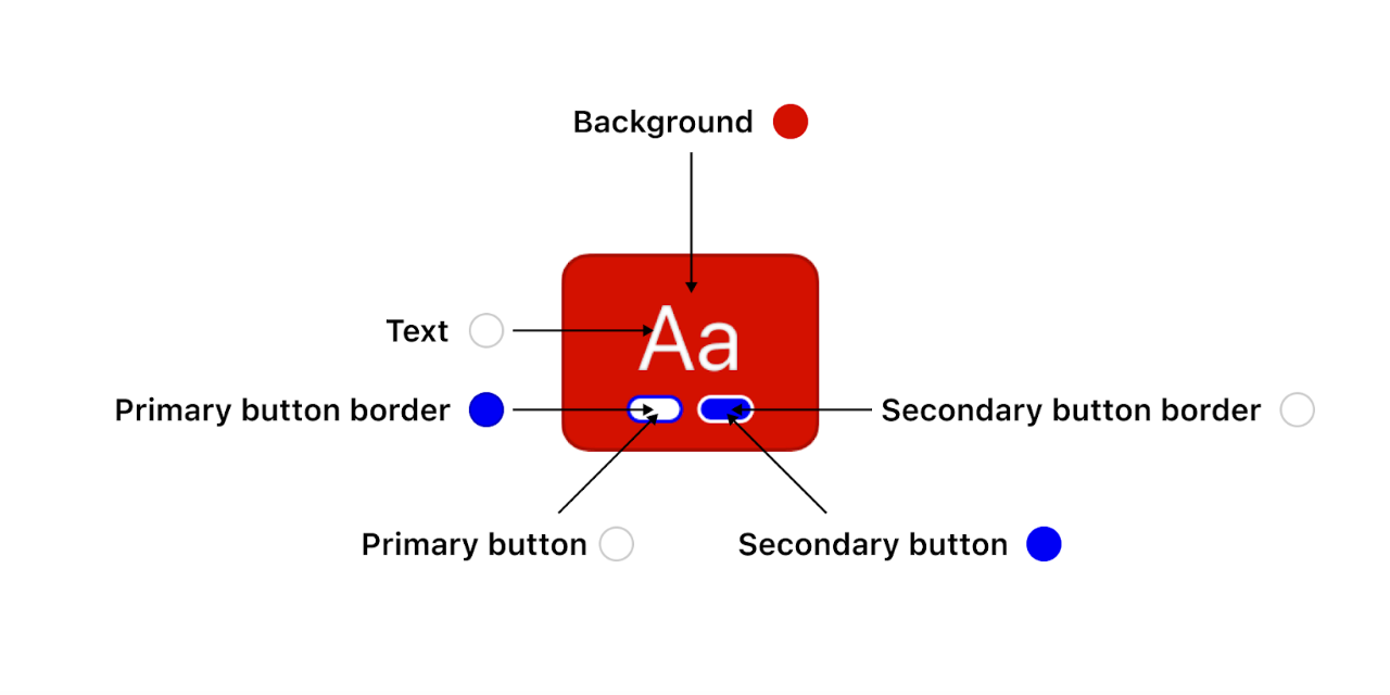
The role field outputs a color scheme preview. The color scheme previews are visible to merchants anywhere in the editor where they might pick a color scheme. You can assign roles to your color scheme definitions to map the color scheme to the previews. For example you can assign role.background to the Background definition. Role uses the following standardized mapping of the color_scheme_group definition to the color scheme preview:
| Role | Description | Required? | Gradient? |
|---|---|---|---|
role.background | Renders the background color of the preview | Yes | Optional |
role.text | Renders the text color of the preview | Yes | No |
role.primary_buttonrole.secondary_button | Render the 1st and 2nd pills in the preview | Yes | Optional |
role.primary_button_borderrole.secondary_button_border | Render the 1st and 2nd pills' border in the preview | Yes | No |
role.on_primary_buttonrole.on_secondary_button | Aren't used in the preview | Yes | No |
role.linksrole.icons | Aren't used in the preview | Yes | No |
Output
Anchor to [object Object]font_picker
font_pickerA setting of type font_picker outputs a font picker field that's automatically populated with fonts from the Shopify font library. This library includes system fonts and a selection of Google Fonts.
You can use this setting type to capture a font selection for various theme elements, such as the base heading font.
For example, the following setting generates the following output:
Setting
Output
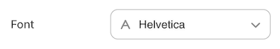
When accessing the value of a font_picker type setting, data is returned as a font object.
The default attribute is required. Failing to include it will result in an error. You can find the possible values through the available fonts in the Shopify font library.
The default attribute is required. Failing to include it will result in an error. You can find the possible values through the available fonts in the Shopify font library.
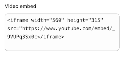
A setting of type html outputs a multi-line text field that accepts HTML markup. In addition to the standard attributes of an input setting, html type settings have the following attribute:
| Attribute | Description | Required |
|---|---|---|
placeholder | A placeholder value for the input | No |
You can use this setting type to capture custom blocks of HTML content, such as a video embed.
For example, the following setting generates the following output:
Setting
Output
The following HTML tags will be automatically removed:
<html><head><body>
When accessing the value of an html type setting, data is returned in one of the following formats:
- A string that contains the entered content.
- An
emptyobject, if nothing has been entered.
Unclosed HTML tags are automatically closed when the setting is saved. This may not line up with your intended formatting, so be sure to verify your input.
Unclosed HTML tags are automatically closed when the setting is saved. This may not line up with your intended formatting, so be sure to verify your input.
Anchor to [object Object]image_picker
image_pickerA setting of type image_picker outputs an image picker field that's automatically populated with the available images from the Files section of Shopify admin, and has the option to upload new images. Merchants also have an opportunity to enter alt text and select a focal point for their image.
You can use this setting type to capture an image selection, such as logos, favicons, and slideshow images.
For example, the following setting generates the following output:
Setting
Output
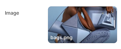
Output (Preview and edit modal)
When accessing the value of an image_picker type setting, data is returned in one of the following formats:
- An
imageobject. - nil, if either no selection has been made or the selection no longer exists.
Settings of type image_picker are not updated when switching presets. image_picker settings also don't support the default attribute.
Settings of type image_picker are not updated when switching presets. image_picker settings also don't support the default attribute.
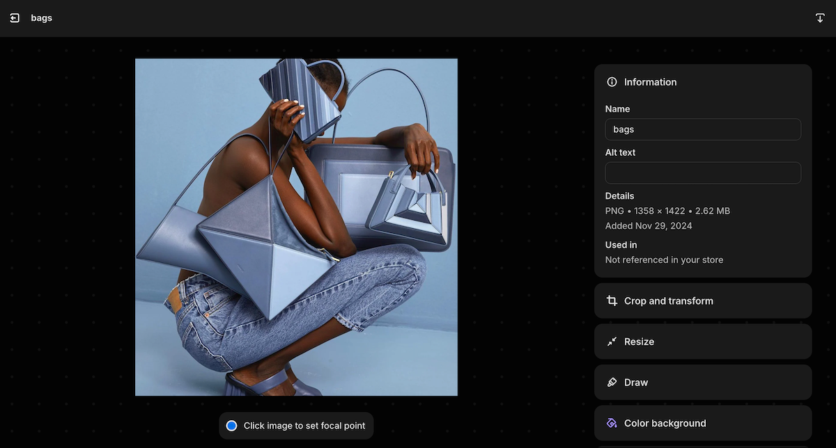
Anchor to Image focal pointsImage focal points
Images selected using an image_picker setting support focal points. A focal point is a position in an image that the merchant wants to remain in view as the image is cropped and adjusted by the theme. Focal points can be set in the theme editor image_picker setting, or from the Files page.
To make sure that your theme respects the focal point of the image, do the following:
- Render your images using the
image_tagfilter. - Consider positioning images within containers using
object-fit: cover.
Using image_tag, if a focal point was provided, then an object-position style is added to the image tag, with the value set to the focal point.
Input
Output
If you need to override the object-position style for a specific use case, then pass a style: object-position: inherit; property to the image_tag filter.
You can also access the focal point data using image.presentation.focal_point.
You can also access the focal point data using image.presentation.focal_point.
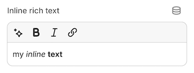
Anchor to [object Object]inline_richtext
inline_richtextA setting of type inline_richtext outputs HTML markup that isn't wrapped in paragraph tags (<p>). The setting includes the following basic formatting options:
- Bold
- Italic
- Link
The inline_richtext setting doesn't support the following features:
- Line breaks (
<br />) - An underline option in the rich text editor. Merchants can underline text using the
Command+UorControl+Ukeyboard shortcut.
The inline_richtext setting doesn't support the following features:
- Line breaks (
<br />) - An underline option in the rich text editor. Merchants can underline text using the
Command+UorControl+Ukeyboard shortcut.
You can use this setting type to capture formatted text content, such as introductory brand content on the homepage.
For example, the following setting generates the following output:
Setting
Output
When accessing the value of an inline_richtext type setting, data is returned in one of the following formats:
- A string that contains the entered content.
- An
emptyobject, if nothing has been entered.
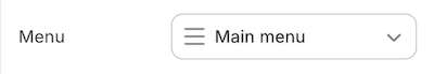
Anchor to [object Object]link_list
link_listA setting of type link_list outputs a menu picker field that's automatically populated with the available menus for the store. You can use this setting type to capture a menu selection, such as the menu to use for footer links.
For example, the following setting generates the following output:
Setting
Output
When accessing the value of a link_list type setting, data is returned in one of the following formats:
- A
linklistobject. blank, if either no selection has been made or the selection no longer exists.
Accepted values for the default attribute are main-menu and footer.
Accepted values for the default attribute are main-menu and footer.
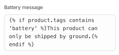
A setting of type liquid outputs a multi-line text field that accepts HTML and limited Liquid markup. You can use this setting type to capture custom blocks of HTML and Liquid content, such as a product-specific message. Merchants can also use a liquid setting to add the code needed to integrate certain types of apps into your theme.
For example, the following setting generates the following output:
Setting
Output
When accessing the value of a liquid type setting, data is returned in one of the following formats:
- A string that contains the entered content.
- An
emptyobject, if nothing has been entered.
The default attribute is optional. However, if you use it, then its value can't be an empty string. Additionally, unclosed HTML tags are automatically closed when the setting is saved. This might not line up with your intended formatting, so be sure to verify your input.
The default attribute is optional. However, if you use it, then its value can't be an empty string. Additionally, unclosed HTML tags are automatically closed when the setting is saved. This might not line up with your intended formatting, so be sure to verify your input.
Anchor to LimitationsLimitations
Settings of type liquid don't have access to the following liquid objects/tags:
- layout
- content_for_header
- content_for_layout
- content_for_index
- section
- javascript
- stylesheet
- schema
- settings
However, liquid settings can access the following:
- Global Liquid objects
- Template specific objects like
collection,product, etc. (within their respective templates) - Standard Liquid tags and filters
If your content includes non-existent, or empty, Liquid tags, then they will be rendered as empty strings. For example, the following setting generates the following output:
Setting
Output
Content entered in these settings can't exceed 50kb. Saving content that either exceeds this limit or includes invalid Liquid will result in an error.
Content entered in these settings can't exceed 50kb. Saving content that either exceeds this limit or includes invalid Liquid will result in an error.
Anchor to [object Object]metaobject
metaobjectA metaobject setting allows merchants to select metaobject entries of a designated type through a picker interface. This setting supports both standard and custom metaobject definitions:
- Standard metaobject definitions: These are readily available in the theme editor and do not need to be pre-enabled on a shop. An example of a standard metaobject is the
product_reviewmetaobject. Learn more about current standard metaobject definitions. - Custom metaobject definitions: These are designed for custom themes and require the metaobject definition to already exist. Note that custom metaobject definitions are not allowed in themes listed on the Theme Store. An example of a custom metaobject would be an
authormetaobject.
Additionally, apps can utilize metaobject settings with their own app-owned metaobject definitions and entries.
metaobject type settings have the following attributes, in addition to the standard attributes of an input setting:
| Attribute | Description | Required |
|---|---|---|
metaobject_type | The metaobject type allowed by the picker. | Yes |
A metaobject setting value can be either of the following formats:
- A
metaobjectobject blankif no selection has been made, the selection isn't visible, or the selection no longer exists
Anchor to Standard metaobject exampleStandard metaobject example
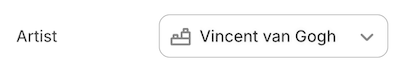
Setting
Output
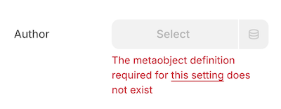
Anchor to Custom metaobject exampleCustom metaobject example
Setting
Output
Anchor to LimitationsLimitations
- Only a single
metaobject_typeis supported at a time, as defined in the setting's schema. - In order for themes to meet publishing guidelines for the Shopify Theme Store, only standard definitions can be used. Custom or app owned definitions cannot be used.
- When referencing a custom or app created
metaobject_type, the definition must exist on the shop and be available to the storefront. If either condition isn't met, the setting will show an error in the theme editor.
Anchor to Usage in appsUsage in apps
Apps can leverage metaobject settings in their app blocks or embeds to enhance theme functionality. By creating metaobject definitions under reserved namespaces, apps can offer advanced configuration options for merchants while maintaining a simple user experience.
Consider an app designed to improve brand storytelling through customer testimonials. Here's a potential implementation:
- Create a custom metaobject definition named
Customer Testimonial - Use app blocks to collect customer data on a post-purchase page
- Write this data as
Customer Testimonialmetaobject entries - Provide a
Testimonialapp block with ametaobjectsetting that uses theCustomer Testimonialmetaobject type - Access the
metaobjectsetting value in Liquid to display the selected testimonials
Setting
Anchor to [object Object]metaobject_list
metaobject_listA metaobject_list setting allows merchants to select multiple metaobject entries of a designated type through a picker interface. This setting supports both standard and custom metaobject definitions:
- Standard metaobject definitions: These are readily available in the theme editor and do not need to be pre-enabled on a shop. An example of a standard metaobject is the
product_reviewmetaobject. Learn more about current standard metaobject definitions. - Custom metaobject definitions: These are designed for custom themes and require the metaobject definition to already exist. Note that custom metaobject definitions are not allowed in themes listed on the Theme Store. An example of a custom metaobject would be an
authormetaobject.
Additionally, apps can utilize metaobject_list settings with their own app-owned metaobject definitions and entries.
metaobject_list type settings have the following attributes, in addition to the standard attributes of an input setting:
| Attribute | Description | Required |
|---|---|---|
limit | The maximum number of metaobject entries that the merchant can select. The default limit, and the maximum limit you can set, is 50. | No |
metaobject_type | The metaobject type allowed by the picker. | Yes |
A metaobject_list setting value can be either of the following formats:
-
An array of
metaobjectobjectsThe array supports pagination using the paginate tag. You can also append
.countto the setting key to return the number of metaobject entries in the array. -
blankif no selection has been made, the selection isn't visible, or the selection no longer exists
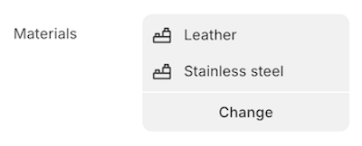
Anchor to Standard metaobject list exampleStandard metaobject list example
Setting
Output
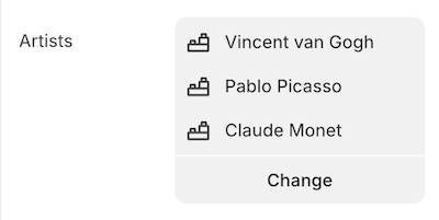
Anchor to Custom metaobject list exampleCustom metaobject list example
Setting
Output
Anchor to LimitationsLimitations
- Only a single
metaobject_typeis supported at a time, as defined in the setting's schema. - In order for themes to meet publishing guidelines for the Shopify Theme Store, custom or app owned definitions cannot be used.
- When referencing a custom or app created
metaobject_type, the definition must exist on the shop and be available to the storefront. If either condition isn't met, the setting will show an error in the theme editor.
Anchor to Usage in appsUsage in apps
Apps can leverage metaobject_list settings in their app blocks or embeds to enhance theme functionality. By creating metaobject definitions under reserved namespaces, apps can offer advanced configuration options for merchants while maintaining a simple user experience.
Using the same example as above, a Testimonials app-block could allow merchants to select multiple testimonial entries. The metaobject_list setting would make this implementation possible.
Setting
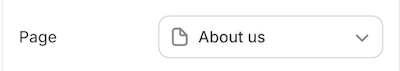
A setting of type page outputs a page picker field that's automatically populated with the available pages for the store. You can use this setting type to capture a page selection, such as the page to feature content for in a size-chart display.
For example, the following setting generates the following output:
Setting
Output
When accessing the value of a page type setting, data is returned in one of the following formats:
- A
pageobject.
To ensure backwards compatibility with legacy resource-based settings, outputting the setting directly will return the object's handle.
blank, if no selection has been made, the selection isn't visible, or the selection no longer exists.
Settings of type page are not updated when switching presets. page settings also don't support the default attribute.
Settings of type page are not updated when switching presets. page settings also don't support the default attribute.
Anchor to [object Object]product
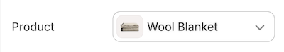
productA setting of type product outputs a product picker field that's automatically populated with the available products for the store. You can use this setting type to capture a product selection, such as the product to feature on the homepage.
For example, the following setting generates the following output:
Setting
Output
When accessing the value of a product type setting, data is returned in one of the following formats:
To ensure backwards compatibility with legacy resource-based settings, outputting the setting directly will return the object's handle.
blankif no selection has been made, the selection isn't visible, or the selection no longer exists
Settings of type product are not updated when switching presets. product settings also don't support the default attribute.
Settings of type product are not updated when switching presets. product settings also don't support the default attribute.
Anchor to [object Object]product_list
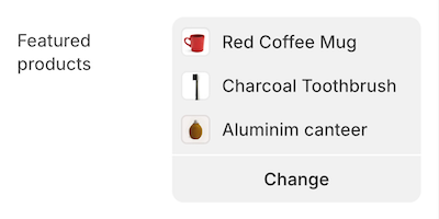
product_listA setting of type product_list outputs a product picker field that's automatically populated with the available products for the store. You can use this setting type to capture multiple products, such as a group of products to feature on the homepage.
You can only choose from products that are published to the online store and have an active status.
You can only choose from products that are published to the online store and have an active status.
In addition to the standard attributes of an input setting, product_list type settings have the following attributes:
| Attribute | Description | Required |
|---|---|---|
limit | The maximum number of products that the merchant can select. The default limit, and the maximum limit you can set, is 50. | No |
Setting
Output
When accessing the value of a product_list type setting, data is returned in one of the following formats:
- An array of
productobjects
The array supports pagination using the paginate tag. You can also append .count to the setting key to return the number of products in the array.
blankif no selection has been made, the selection isn't visible, or the selection no longer exists
Anchor to [object Object]richtext
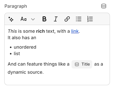
richtextA setting of type richtext outputs a multi-line text field with the following basic formatting options:
- Bold
- Italic
- Underline
- Link
- Paragraph
- Unordered list
No underline option appears in the rich text component. Merchants can underline text using the Command+U or Control+U keyboard shortcut.
No underline option appears in the rich text component. Merchants can underline text using the Command+U or Control+U keyboard shortcut.
You can use this setting type to capture formatted text content, such as introductory brand content on the homepage.
For example, the following setting generates the following output:
Setting
Output
When accessing the value of a richtext type setting, data is returned in one of the following formats:
- A string that contains the entered content.
- An
emptyobject, if nothing has been entered.
Anchor to [object Object]default
defaultThe default attribute isn't required. However, if it's used, then only <p> or <ul> tags are supported as top-level elements.
The following HTML tags are also supported inside the parent <p> tag:
<p><br /><strong><b><em><i><u><span><a>
Failing to wrap the default content in <p> or <ul> tags will result in an error.
Failing to wrap the default content in <p> or <ul> tags will result in an error.
Anchor to [object Object]text_alignment
text_alignmentA setting of type text_alignment outputs a SegmentedControl field with icons. In addition to the standard attributes of an input setting, text_alignment type settings support the following attribute:
| Attribute | Description | Required |
|---|---|---|
| Default | The initially selected value. Can be one of left, right, center. The default value is left. | No |
The following default values can't be changed to a different value:
| Value | Icon presentation |
|---|---|
| Left |  |
| Right |  |
| Center |  |
For example, the following setting generates the following output:
Setting
Output
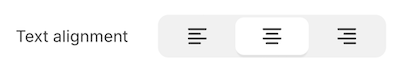
When you access the value of a text_alignment type setting, data is returned as a string.
If you don't specify the default attribute, then the left option is selected by default.
If you don't specify the default attribute, then the left option is selected by default.
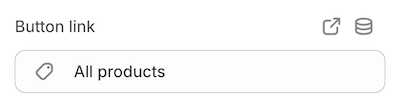
A setting of type url outputs a URL entry field where you can manually enter external URLs and relative paths. It also has a picker that's automatically populated with the following available resources for the shop:
- Articles
- Blogs
- Collections
- Pages
- Products
You can use this setting type to capture a URL selection, such as the URL to use for a slideshow button link.
For example, the following setting generates the following output:
Setting
Output
When accessing the value of a url type setting, data is returned in one of the following formats:
Accepted values for the default attribute are /collections and /collections/all.
Accepted values for the default attribute are /collections and /collections/all.
A setting of type video outputs a video picker that's automatically populated with the available videos from the Files section of the Shopify admin. The merchant also has the option to upload new videos.
For example, the following setting generates the following output:
Setting
Output

The video type setting also accepts metafields of type file_reference as a dynamic source.
When accessing the value of a video type setting, data is returned in one of the following formats:
- A
videoobject. - nil, if:
- no selection has been made,
- the selection no longer exists, or
- the selection is a
file_referencemetafield that points to a non-video file.
video settings don't support the default attribute.
video settings don't support the default attribute.
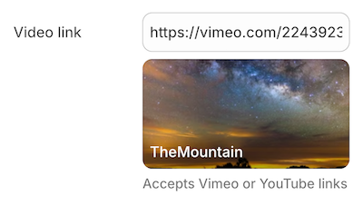
Anchor to [object Object]video_url
video_urlA setting of type video_url outputs a URL entry field. In addition to the standard attributes of an input setting, video_url type settings have the following attributes:
| Attribute | Description | Required |
|---|---|---|
accept | Takes an array of accepted video providers. Valid values are youtube, vimeo, or both. | Yes |
placeholder | A placeholder value for the input. | No |
This setting type can be used to capture a video URL from YouTube and/or Vimeo, such as the URL for a static video to show in the product description.
For example, the following setting generates the following output:
Setting
Output
When accessing the value of a video_url type setting, data is returned in one of the following formats:
Additionally, there's access to the id and type (YouTube or Vimeo) of the video.
For example, assuming you're using this video with the above setting, the following Liquid generates the following output:
Setting
Output
Anchor to Create linksCreate links
You can add links to the info settings attribute by enclosing the link text in brackets and then following it immediately with the URL in parentheses.
For example, the following setting generates the following output:
Settings
Output